The Template
Territory’s icon guidelines were rolled out across the website and mobile apps.
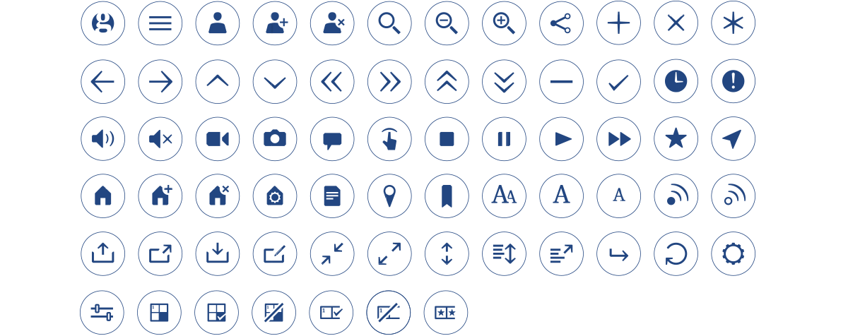
When the UK’s leading independent newspaper needed a suite of icons to support its digital redesign, Territory stepped in to define and craft a bespoke system.
Read MoreAs part of a complete redesign of the Guardian’s digital channels, we were approached by Creative Director Alex Breuer with a brief to define and craft a consolidated system of icons for use in the new app and online services. In collaboration with the Guardian’s digital team we began by exploring the paper’s notable typeface elements and the adaptations that would bring it to life in digital, as well as user journeys and expectations of icons as wayfinding systems.
Territory’s icon guidelines were rolled out across the website and mobile apps.
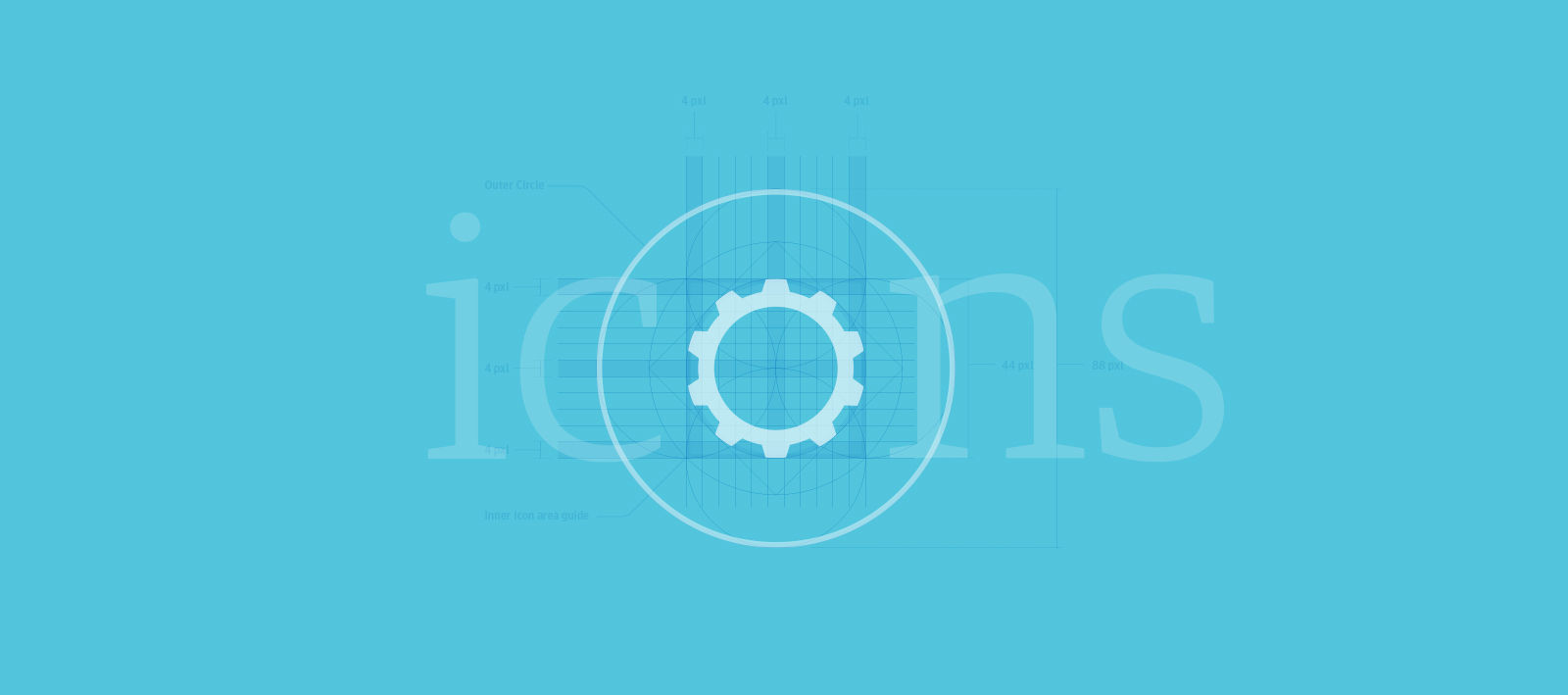
To ensures legibility onscreen and consistency throughout, we took special care into designing the icons that retain fidelity when used at small sizes.
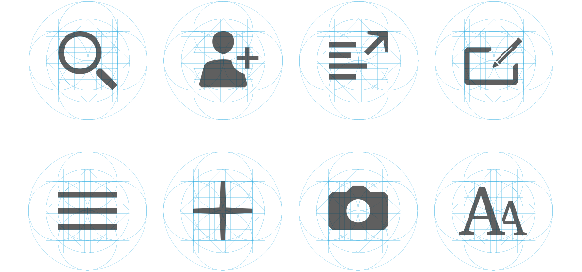
Using a defined pixel grid as the bases for construction template, we ensured fidelity at every point size across platforms and devices.
Based on the inherent characteristics of Guardian Egyptian (a typeface originally created by Christian Schwartz and Paul Barnes) an initial set of 75 icons have been developed to complement the typeface and communicate the same design language.