As technology increasingly dominates our day to day lives, it has been absorbed into the fabric of storytelling. Today, technology is a powerful narrative device, a lens through which story unfolds.
Storytelling has long belonged to narrative — written, read, performed, animated or filmed. And so it should; after all, the elements of narrative provide structure and give form, meaning and purpose to themes, arcs, plot, action, mode, voice, character and world.
As technology has been absorbed into our day to day activities, it has been woven into the fabric of storytelling. Just as we now watch friends, colleagues, politicians and society play out dramas on our technology of choice, so we see these devices incorporated into stories.
At Territory we’ve seen how technology has come to play an increasingly important role in modern storytelling. From the early days of science fiction, technology has been used to support the story and director’s vision. Think of Dr Who and Star Trek on television in the 1960s, or 2001: A Space Odyssey (1968) and Star Wars (1977) on the big screen, to the most recent episode of Electric Dreams or Ghost in the Shell — in each one, technology is a powerful narrative device that helps to establish context, explain action and support performance and world building.
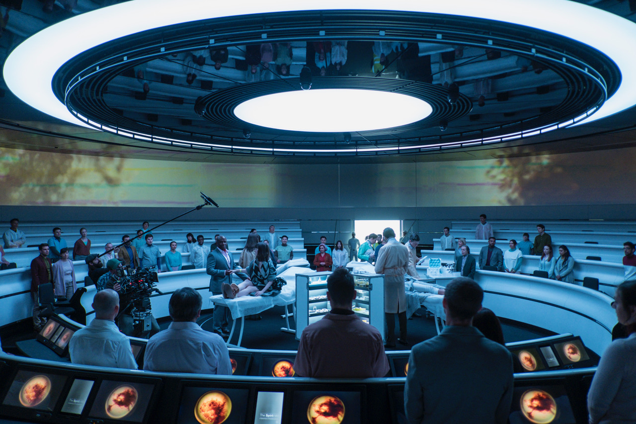
As motion graphics specialists working across film, TV, games and brands we find ourselves asked to support narrative using technology as a lens through which story unfolds. Over the years we have been privileged enough to create fictional technology and interfaces for a number of amazing films — from Prometheus to Blade Runner 2049.
Story, design and technology are at the heart of our approach to visualising technology for film, and we’d like to share a bit more about how these three elements work together to create technology as narrative device.
Story The starting point of any brief is the story — the narrative that drives the action or message. Our best work is the result of a collaborative relationship with directors, production designers and art directors who value the role that technology interfaces can play in revealing a pivotal story point, bringing characters and audience together in one powerful moment.
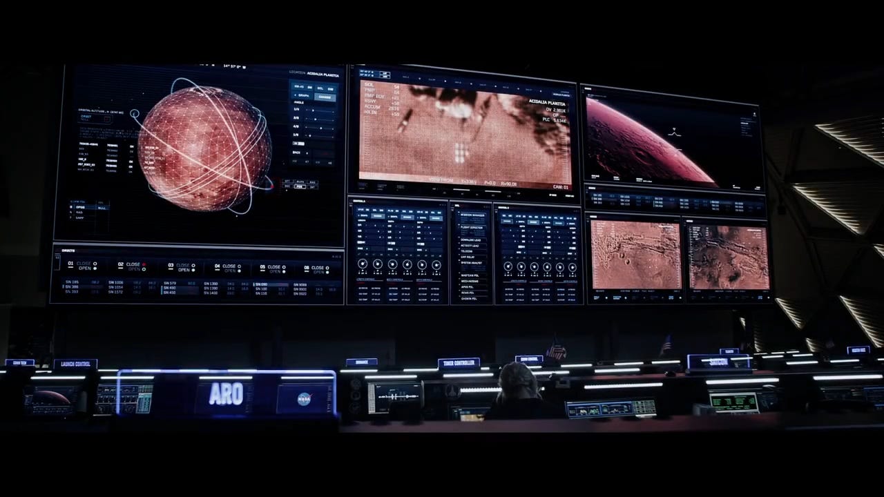
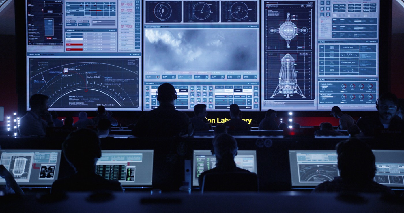
Just think of the moment in The Martian, when NASAs team realised that Mark Watney was alive by looking at giant screens in Mission Control. Our meticulously designed scenes showing satellite imagery of the habitat became a window linking earth to Mars, allowing actors and audience to share and absorb the shock of discovery and its implications.
Design But technology alone doesn’t necessarily do the job. As both film fans and designers, there’s nothing worse than poorly conceived and realised technology that just doesn’t match the expectations of today’s sophisticated audience. To be effective storytellers, we believe that technology needs strong and well crafted design to support that narrative point, authenticate action, and lend credibility to the cinematic experience. There are many ways to achieve that, but to avoid formulaic genre conventions that can feel stale, a bespoke design approach is essential.
Our first film project was formative in the creative direction offered by Ridley Scott. He didn’t want references to Alien in his prequel to that iconic film. He saw the technology interfaces for Prometheus as entirely different. ‘The Prometheus’, a super advanced scientific research vessel powered by an AI needed a unique interface design that alluded to its sophistication and intelligence. Rather than explore films of the same genre, Scott pointed us to the work of abstract artists, modern dance choreographers, composers, marine life and corals. His direction liberated us from genre conventions and we try to apply that same freedom to explore emotional rather than rational thematic connections in all our work.

The designers eye, as we call it, doesn’t stop with emotive connections, but extends to thinking about how a futuristic technology will feel and occupy space, how it will take form on set, how the characters will engage with it. During our R&D phase we ask questions more associated with physical products. What will it look like, what powers it, how will it be turned on, how will light reflect through it, off it, or from it, how will someone hold it, feel the weight of it. This appreciation for its theoretical physicality leads to more credible products in a science fiction or fantasy film. Our work on Jupiter Ascending and Guardians of the Galaxy illustrate this well, as does the more recent work on Ghost in the Shell.
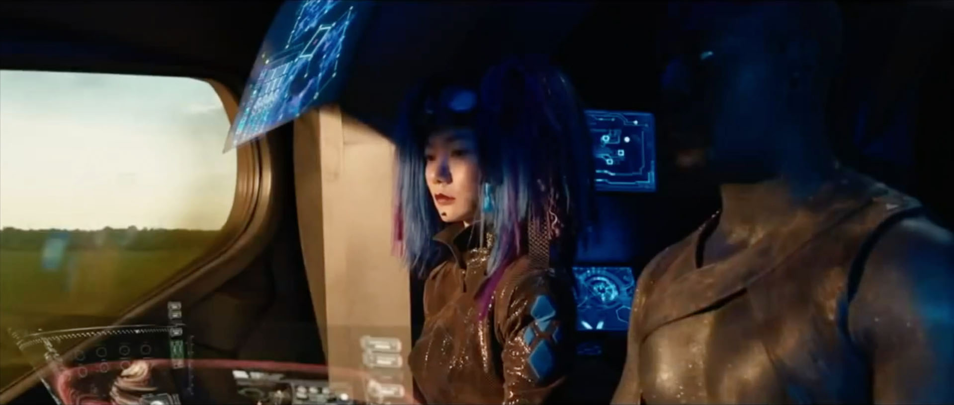
The Wachowski’s space opera hinged on travel through wormholes, and they wanted screens on the spacecrafts control bridge to tell this story. Never having used screens on-set before, they were thrilled with the physicality, and we explored a number of different screens to lend depth and texture to the beautiful isometric representations of gravitational events. After experimentation we adopted etched glass panels with bevelled edges for a uniquely elegant, yet futuristic look and feel to the interface. Once fixed on set, we projected the graphic animations on them, and the final result is crafted and original, with a luminescence that would have been impossible to capture in CG alone.
Similarly, one of the challenges on Guardians of the Galaxy was to create a physical navigation device for the evil Ronan that conveyed his raw hatred and repulsion of the human race. Exploring various conceptual routes that sought to physically represent aggression, malevolence, power and intent, we developed a malleable transparent sphere in VFX, that was manipulated through finger pressure. Mapping to gestures, the sphere perfectly conveyed the character’s evil qualities.
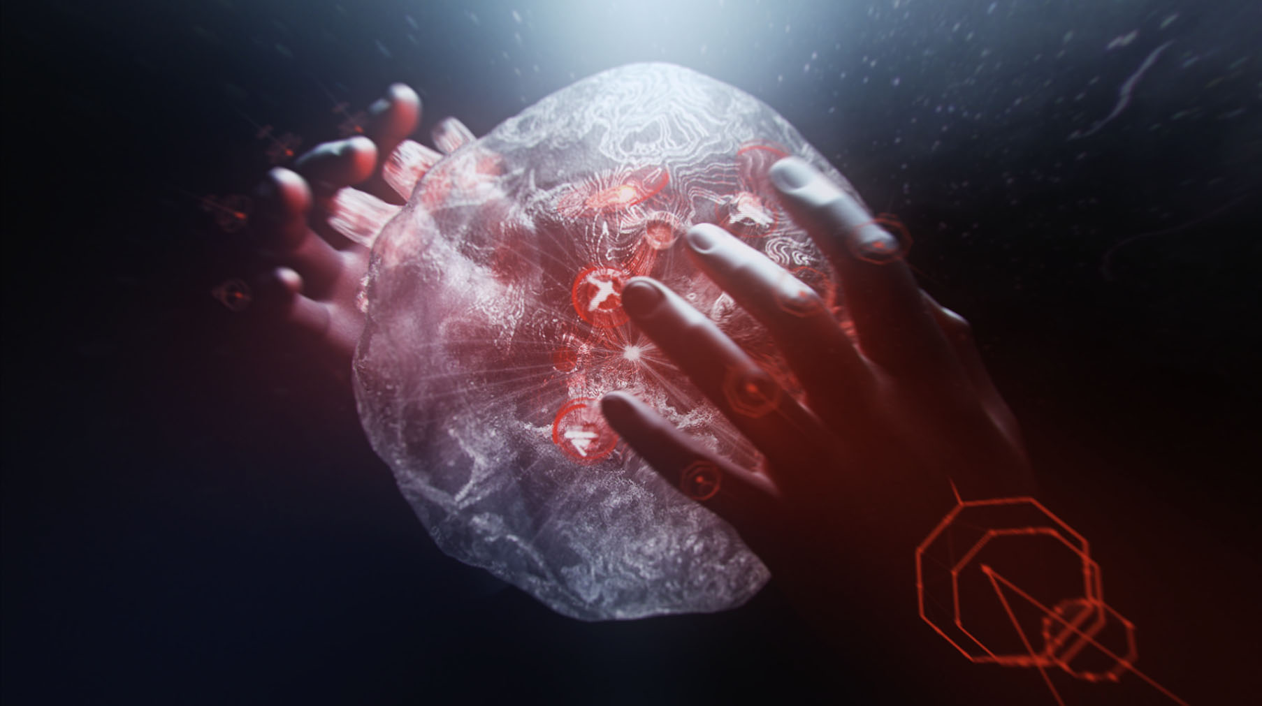
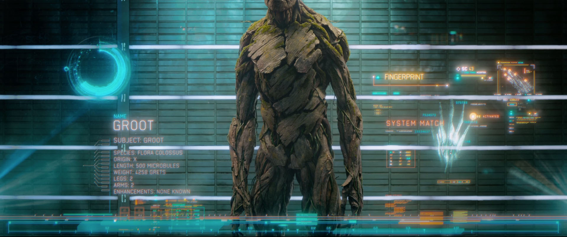
But design isn’t just about the physical, it is also about creating a cohesive visual language that resonates with the characters, culture, creatures, environments and plot. On Guardians of the Galaxy, we designed for humans, animals, trees and aliens, for political organisations, prisons, cultures and spacecraft. Each one needed to feel distinct from the other, and reflect differences of language and purpose and technological sophistication. We almost ran out of colours on that project.
The Martian also demanded a variety of visual languages that reflected a more restrained scientifically grounded near future design. We worked closely with NASA to understand the technical systems they work with in reality, what the data streams and live feeds mean and how important human control and intervention is at every stage of space travel. We were given a phenomenal insight into the every day communication concerns of space travel and rocket launches, of their plans for new spacecraft and martian rovers, of the navigation needs, mission requirements and habitats on Mars. Building on that R&D, we devised a new visual language that respected the data flows of real mission control, but tied it together in a visual palette and UI design that made it more consistent, and most importantly, easier for the audience to ‘read’. This last point required creative license in adding warning markers and alerts to support story beats and performance. While they would never occur in the real mission control, the demands of keeping audiences informed in a 3 second camera shot meant that we had to balance fictional narrative devices and the facts of real world scientific data.
Technology The final point that informs our approach at Territory is technology itself. Our passion for storytelling, design and technology converge on fantasy projects that require completely new technologies and more fact driven projects, where screens across multiple devices are used, playing each one to its strength as used in the real world.
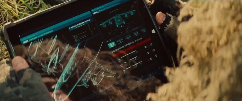
In American Assassin or Mission Impossible: Rogue Nation, our screen graphics reflect the variety of devices we all use everyday — wall screens, desktop monitors, laptops, tablets, smartphones are all represented with device specific design that play into story beats, in the same way that each one does in our own lives.
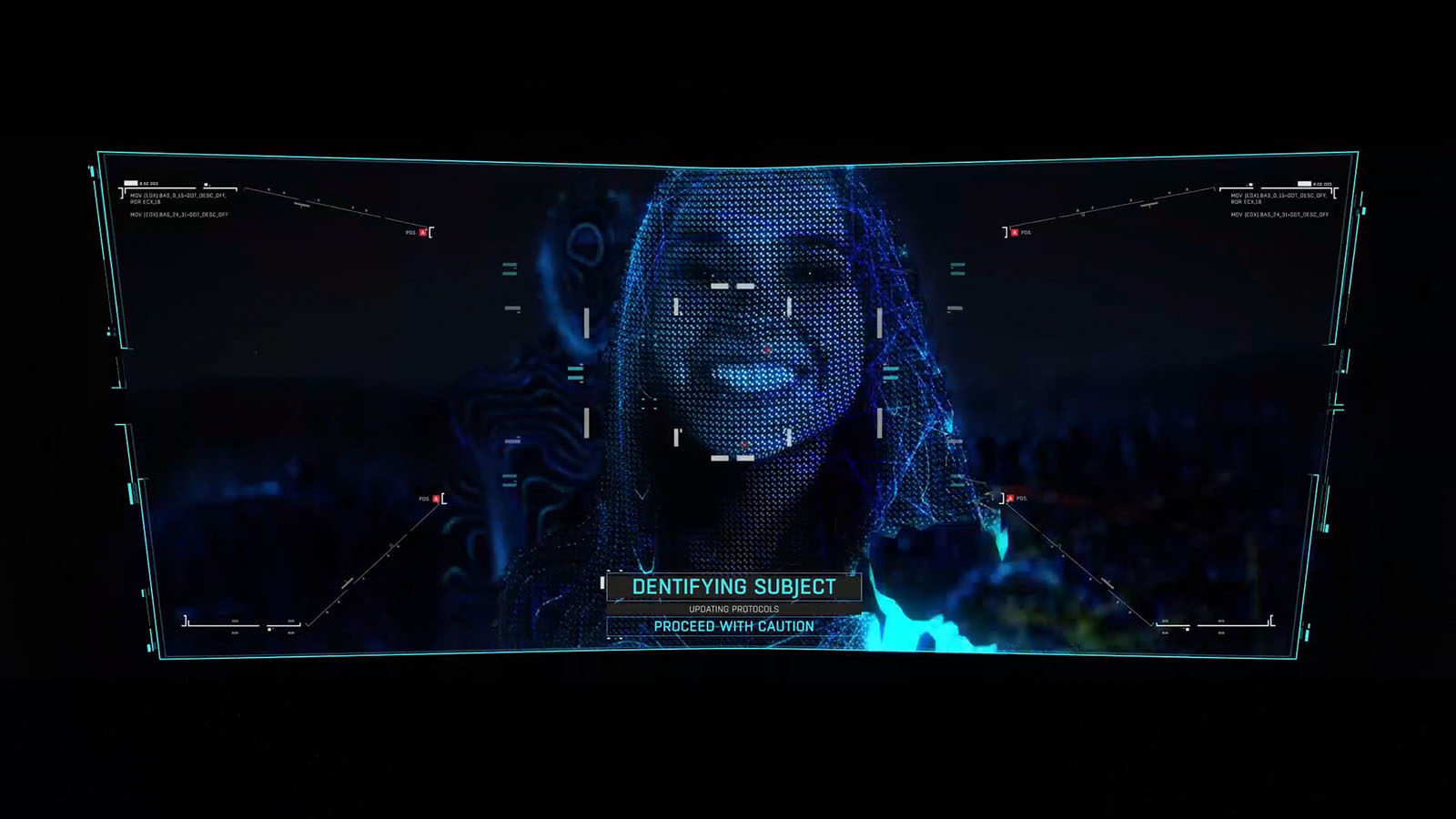
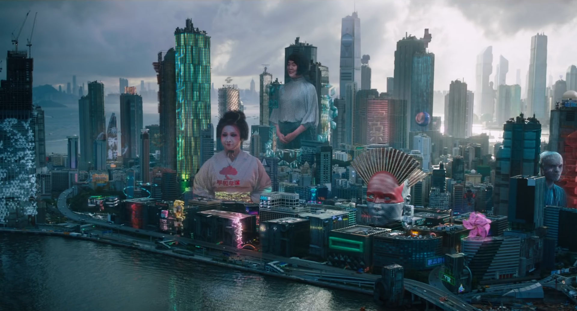
Ghost in the Shell is another example of a fantasy brief that asked for new technology to support the sophistication of a society where technology is seamlessly integrated into the very fabric of society, where AI and cybernetic enhancements are part of the character’s lives. For a design-led studio, the chance to shape futuristic technology and contribute to the look and feel of a new world is incredibly exciting.
Briefed to bring content and interaction into the 3rd dimension, we set about exploring how digital content could exist outside of the flat screen. Holographic is a natural vehicle for this type of content and we approached the brief with a designers eye for detail, asking questions relating to the quality of the physical product, content generation and user experience. We extended the exploration to consider narrative themes and visual references from the original manga and animes.
A story about what is human in a cyber-enhanced and AI driven world, we sought to incorporate organic qualities in the perceived physicality of this advanced technology. We experimented with different degrees of physicality, looking to balance organic references and technological sophistication. Working up concepts, we explored a voxel route in which digital particles were big and chunky to begin with, and a ‘digital sand’ route that behaved like fine sand does. From data streams to architectural building plans, film footage to scale models, our tests showed how the different concepts sat within the context of narrative story beats, performance and set.
Territory’s holographic and 3D concepts for Ghost in the Shell (2017)
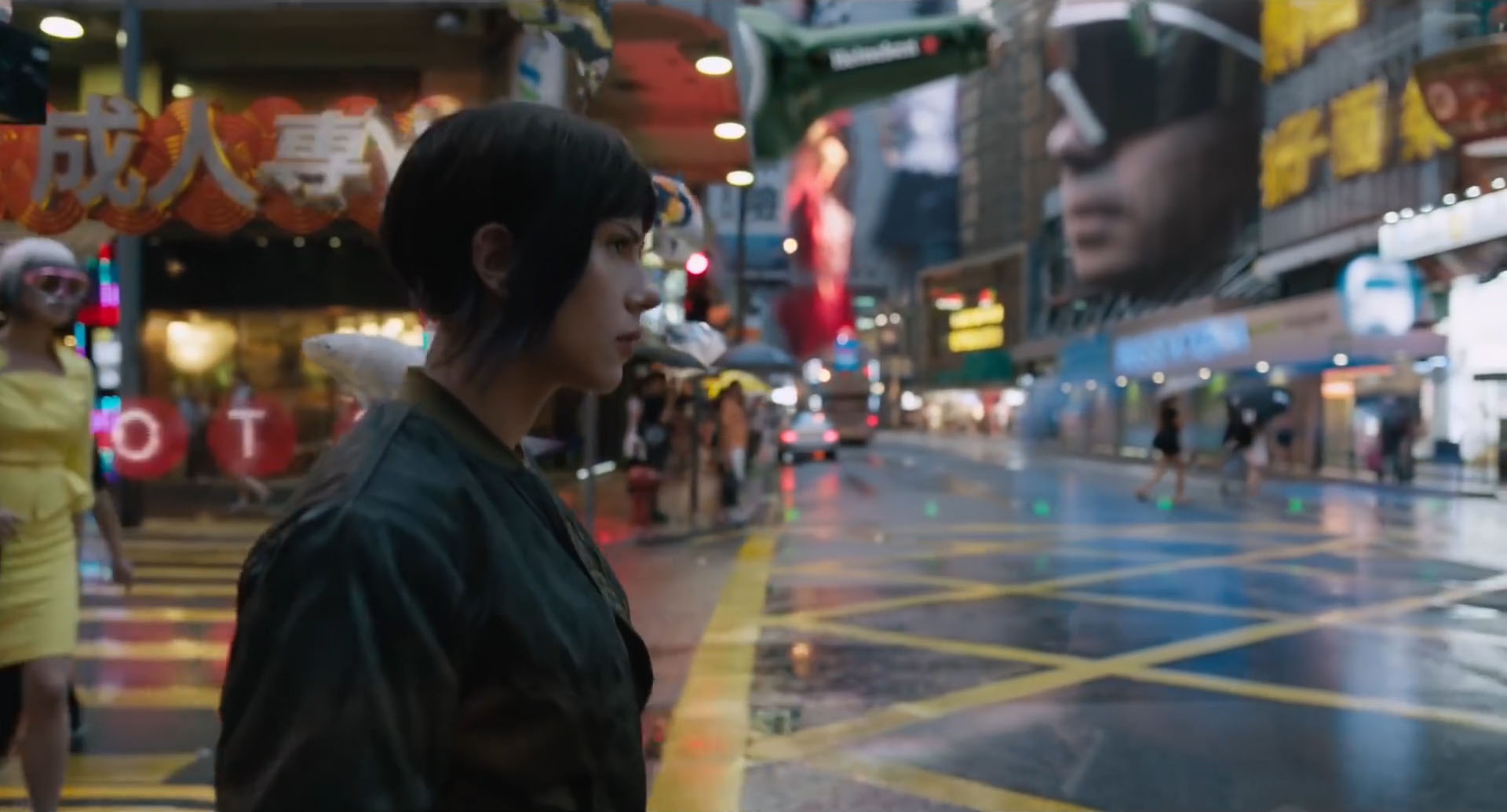
The technical challenges continued with the creation of 3D assets for the cityscape and street scenes, which required an original treatment to bring the director’s vision to life. Again, holographics and 3D extrusions formed the basis of advertising elements, window dressings, building wrappers, brand logos and signage, and road signs. And, again, to achieve credibility against the backdrop of high definition plates, we had to consider these elements as physical objects and explore particle density, light sources, reflections, movement and behaviour in a busy urban environment. The final result contributes to the originality of this futuristic city and lends credible layers and textures to the visual clutter that populates the tallest buildings to grubby streets. From high end sophistication and wealth, advertising, political and religious messages and logos, to glitchy low tech, all are part of this world.
As technology becomes more sophisticated and our expectations are shaped by fantasy and science fiction films, it plays an increasingly important role in mediating information and this extends to real world and factual content. We recently had the privilege to work with Beyond Words Studio on a data visualisation project for the Neglected Tropical Disease Summit 2017. A unique 30m x 5m canvas of LED screens was the lens through which this story would be told, and the challenge was to create visual impact without comprising narrative integrity. Bringing our creative storytelling, design and technology expertise to a brief rooted in factual data and saving lives, we crafted an immersive animation about the greatest health intervention in human history. This emotive visual narrative tells a powerful story about scale, progress and hope and the 3 minute animation formed a dynamic backdrop to the milestone summit in Geneva.
The Cascade installation is a collaboration between Territory and Beyond Words Studio for the Neglected Tropical Disease Summit 2017
As technology continues to evolve, we’re constantly challenged to keep up with innovations and possibilities, and the dynamics of this space makes it incredibly exciting. Straddling entertainment and technology, fantasy and fact, we relish the creative challenges that near and future technology offer.
