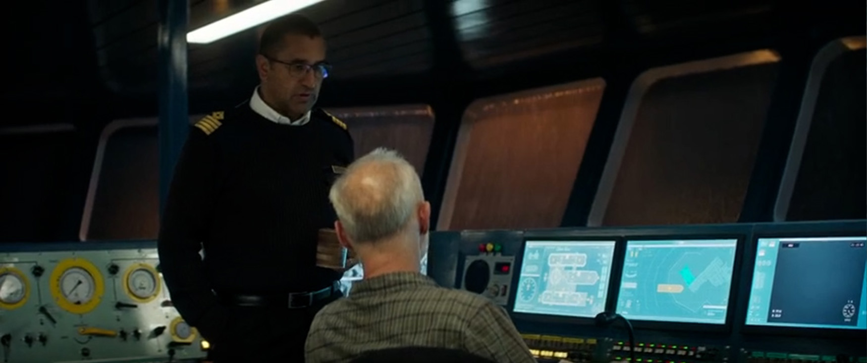
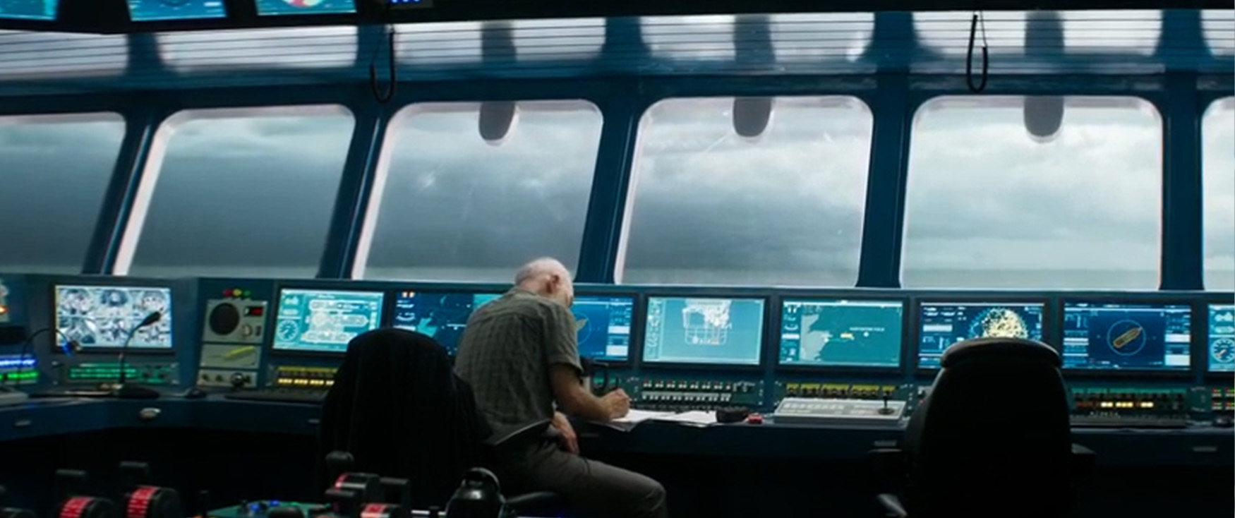
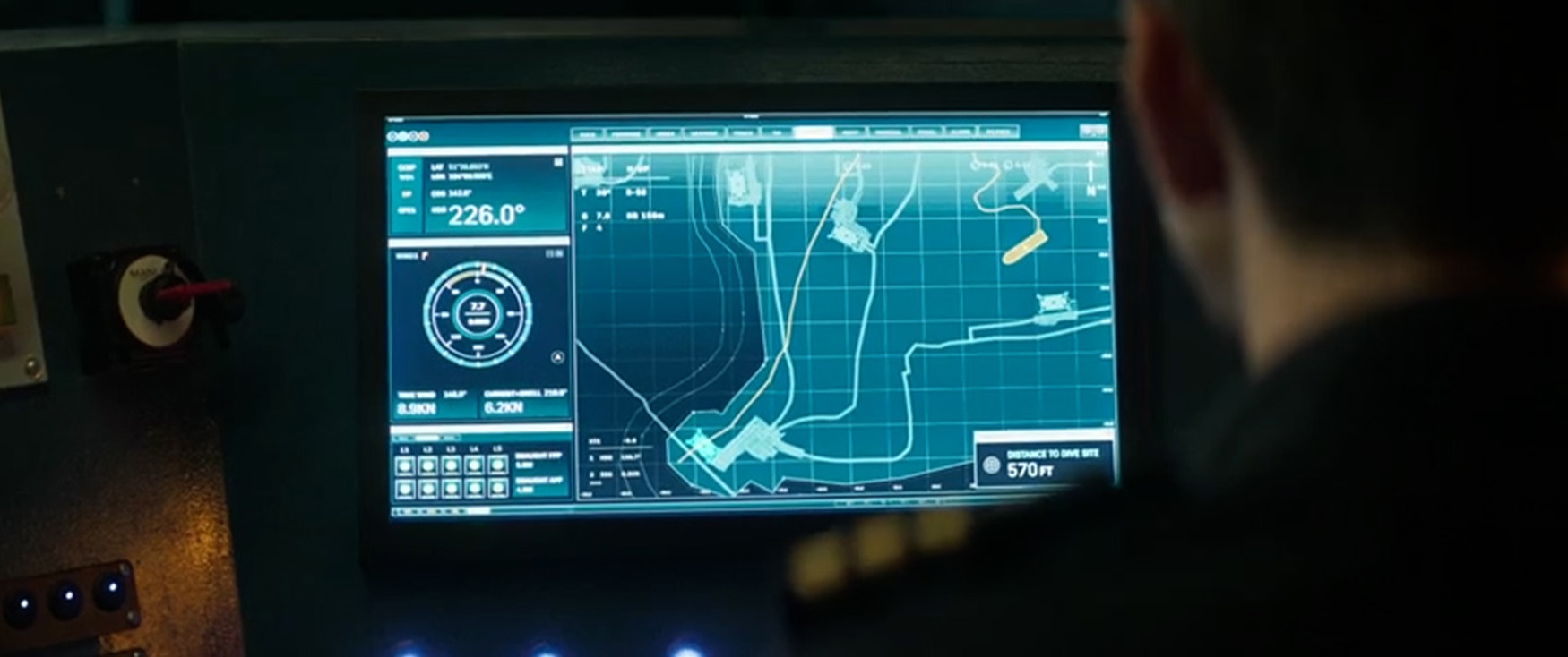
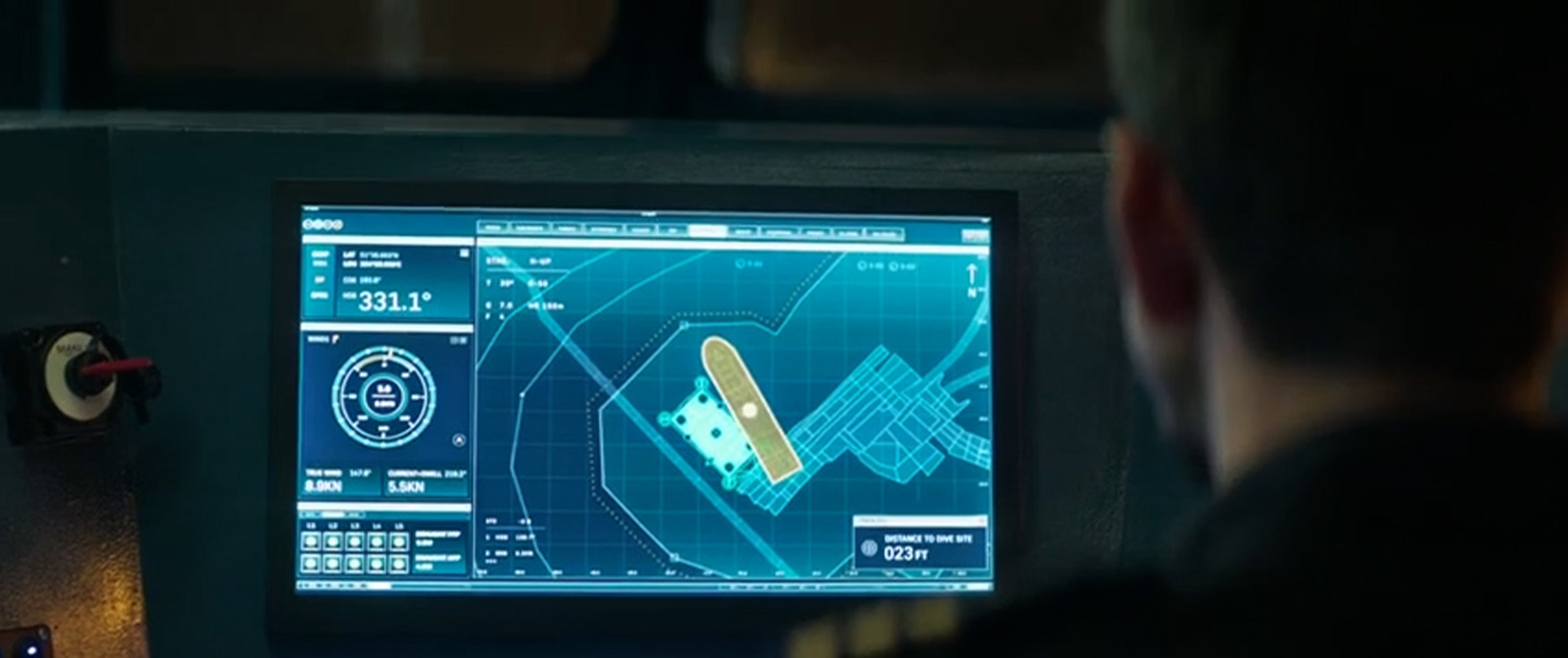
The Bridge
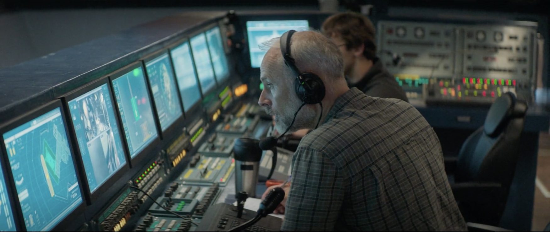
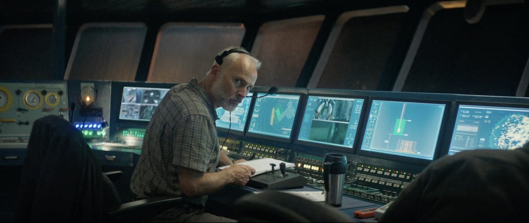
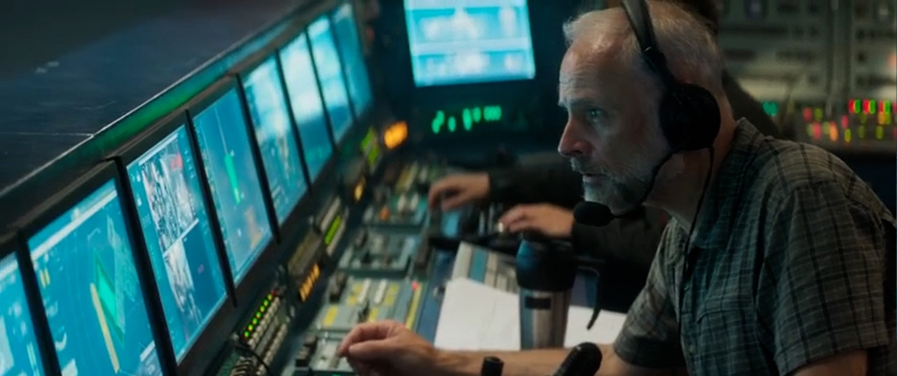
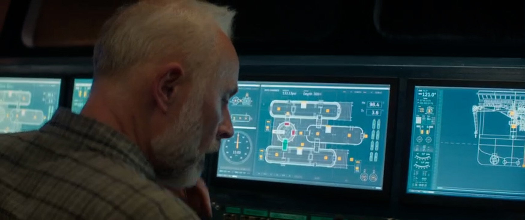
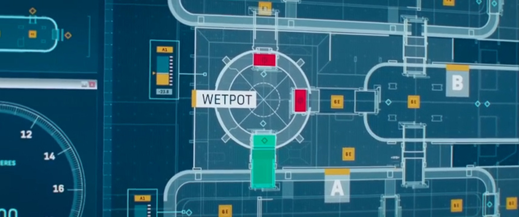
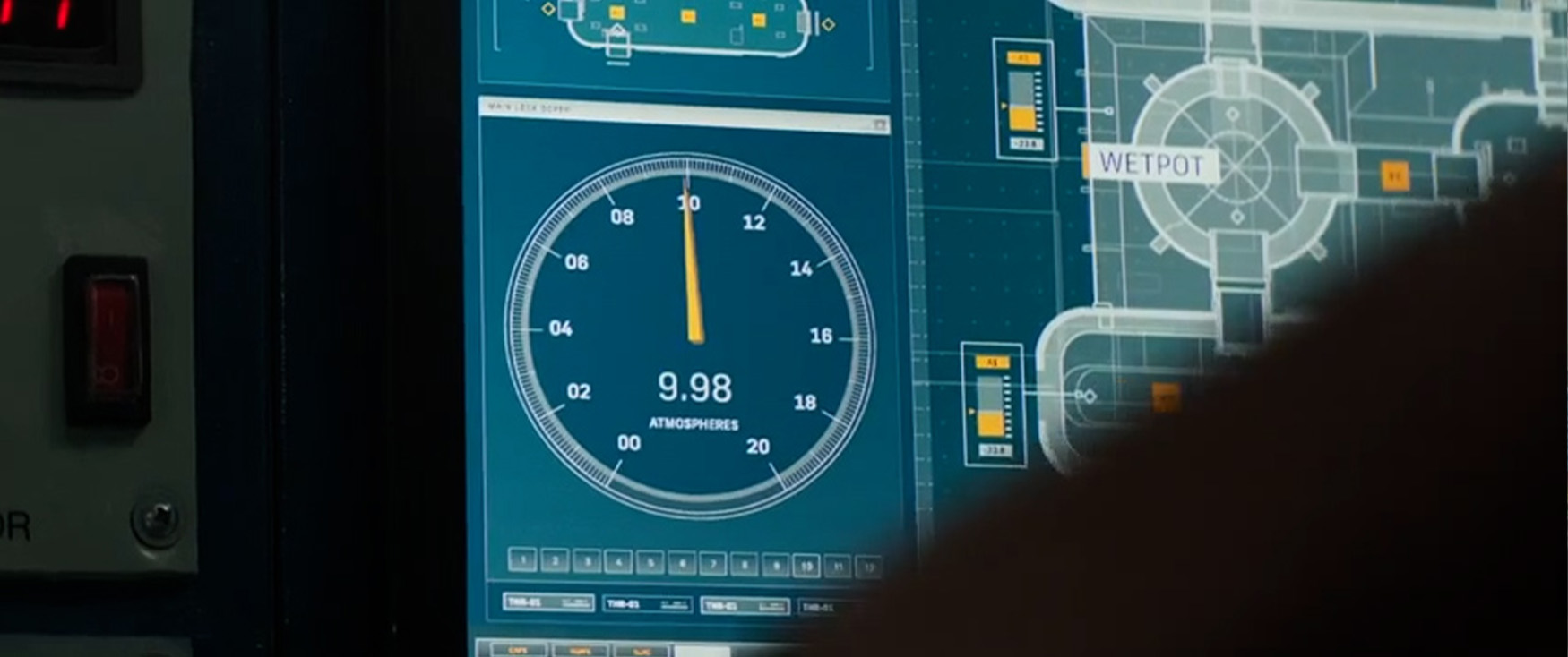
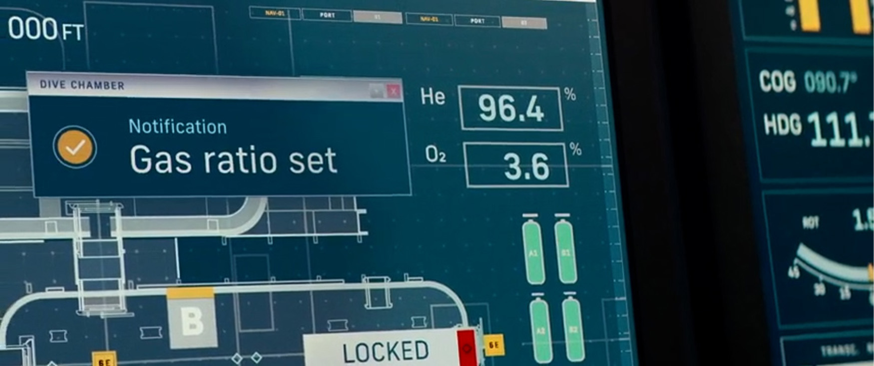
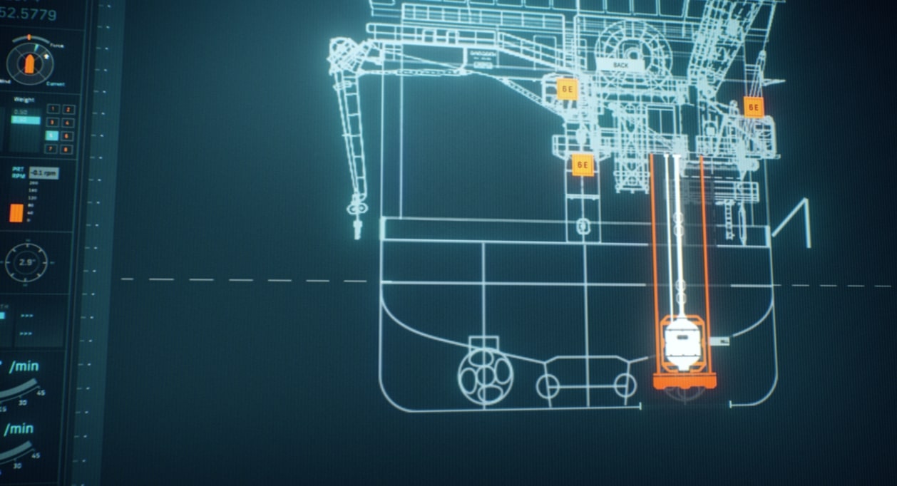
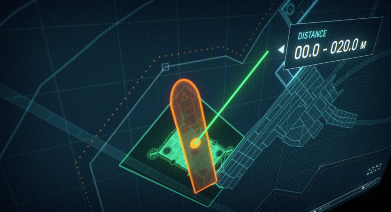
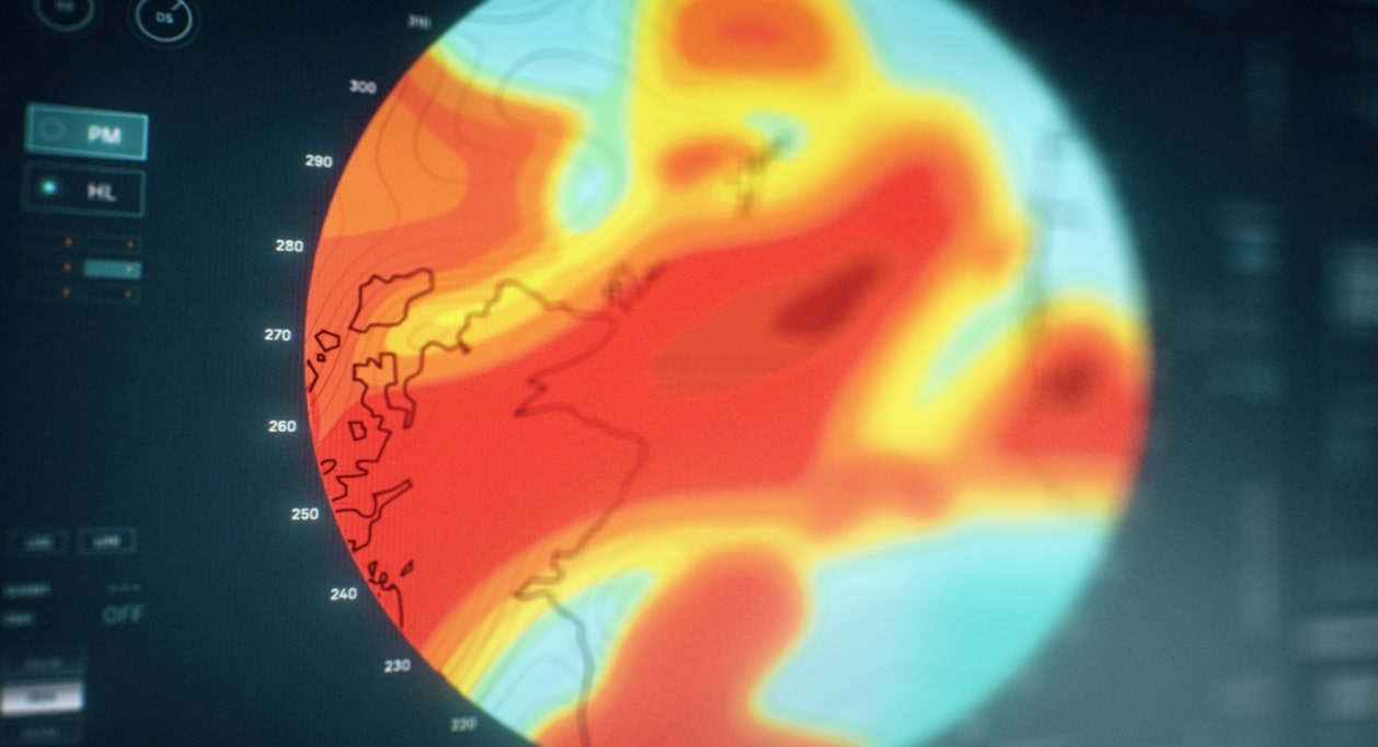
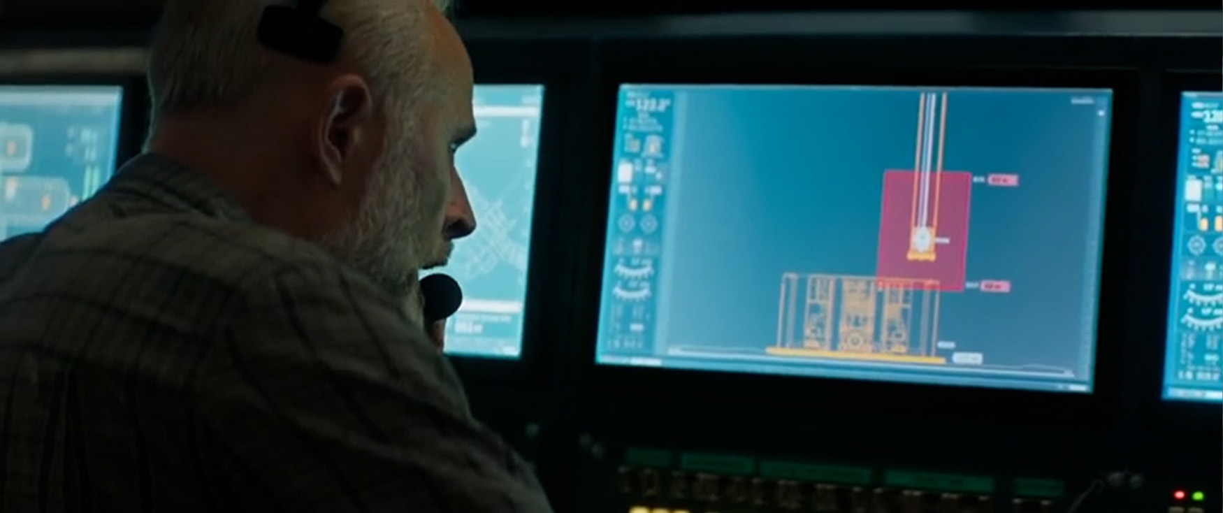
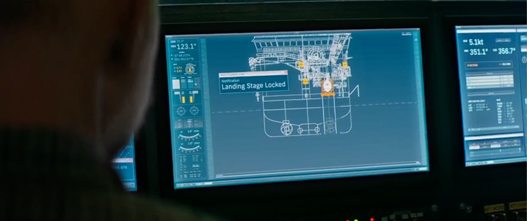
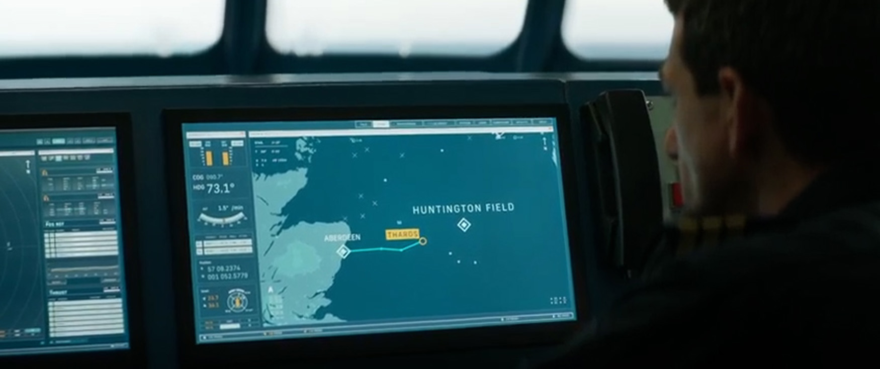
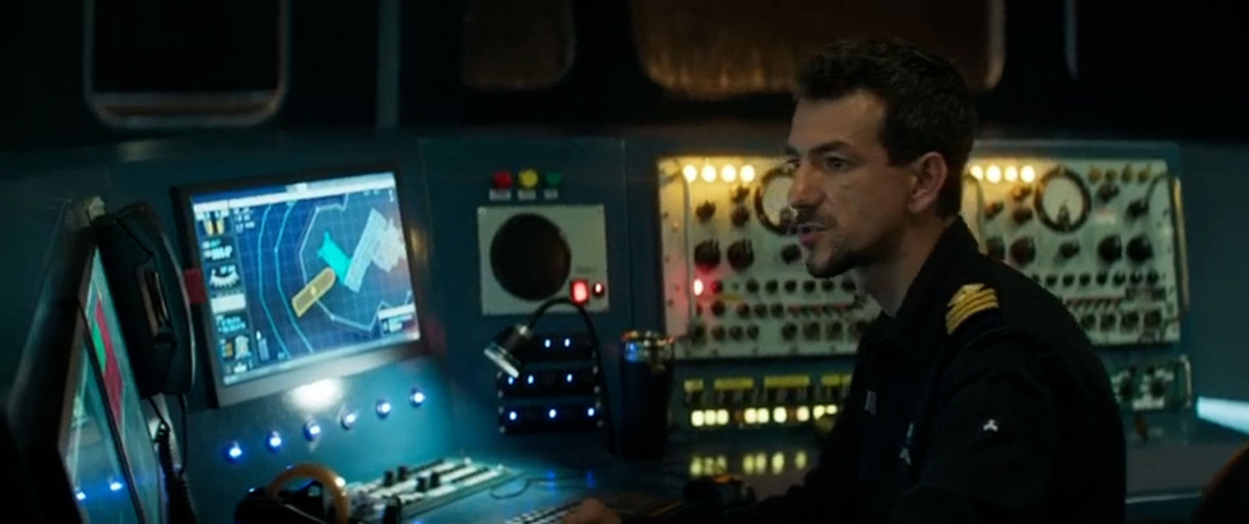
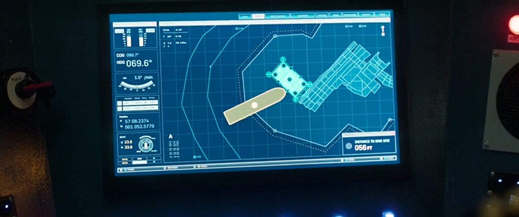
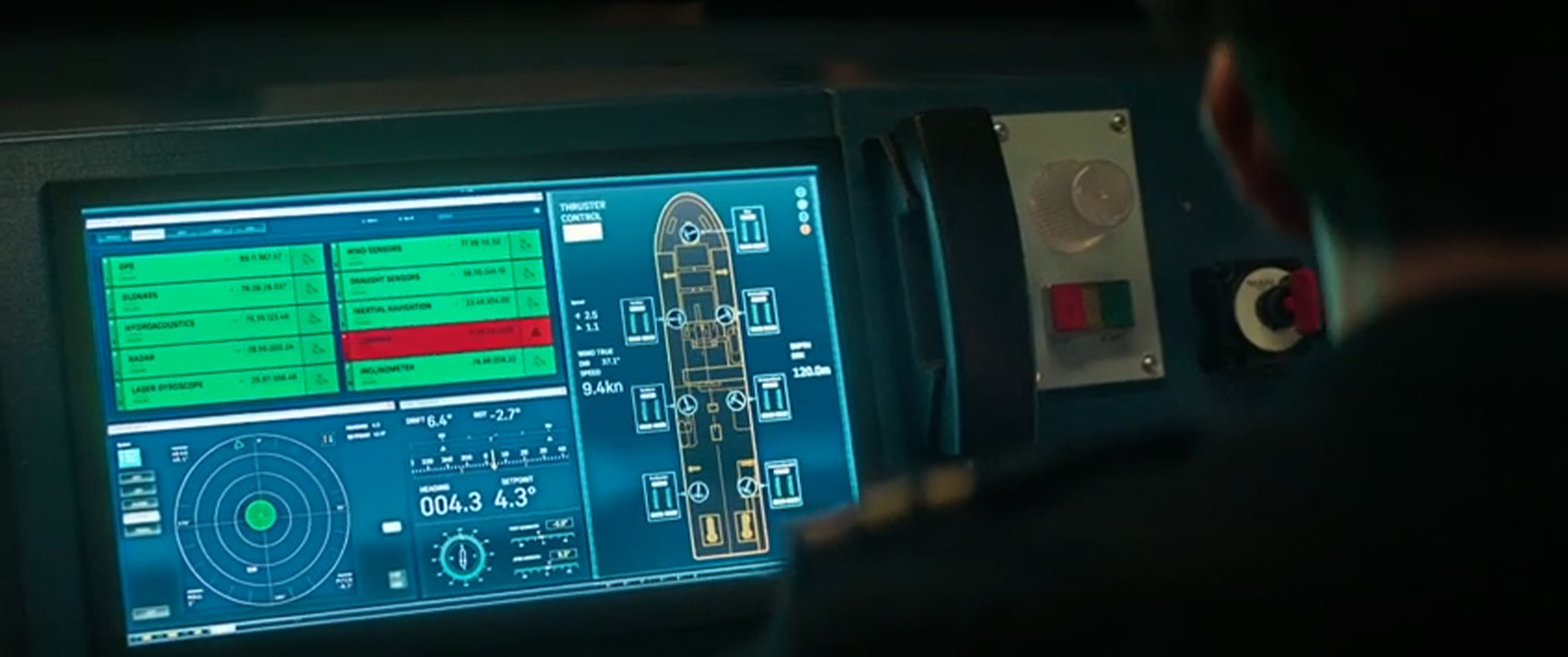
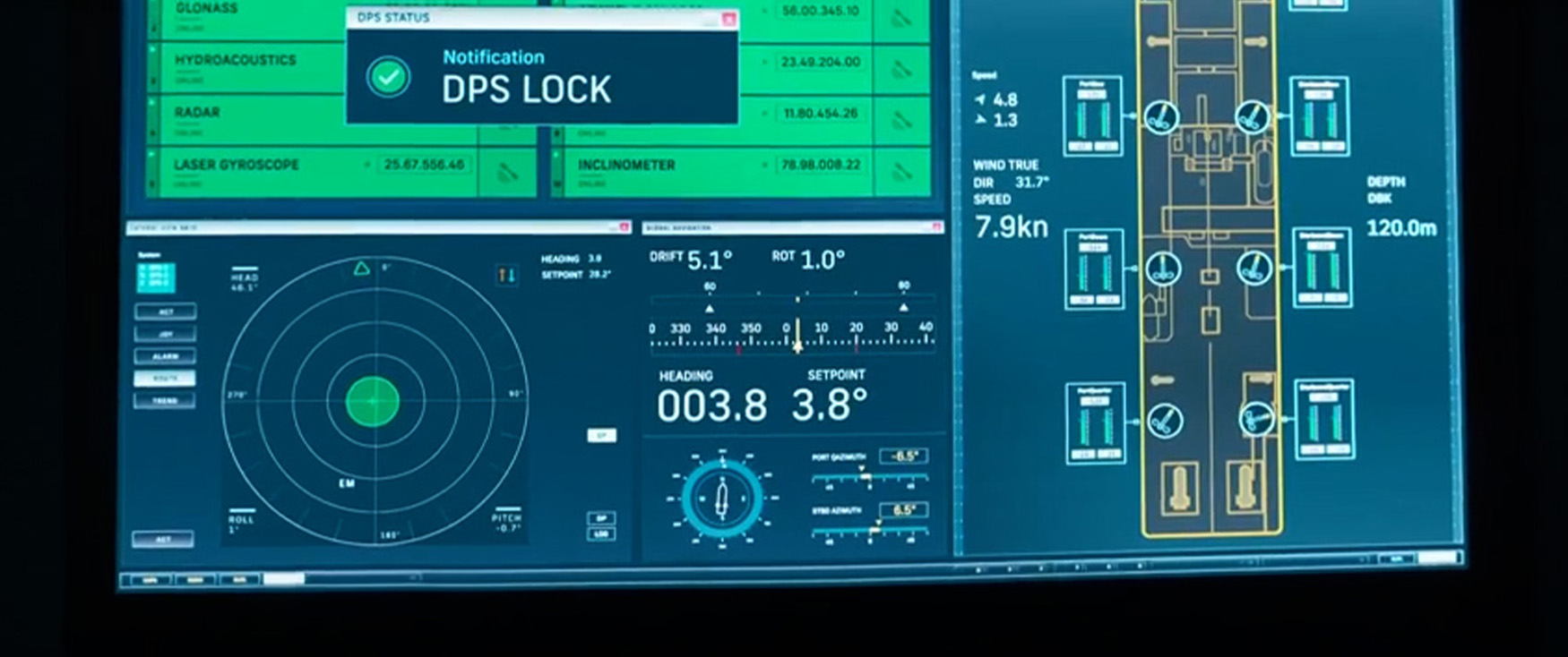
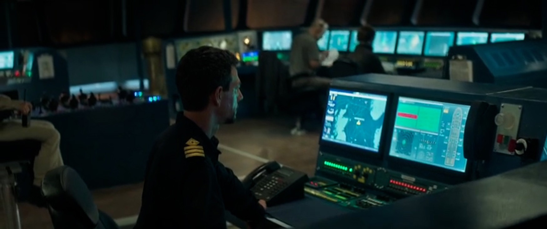
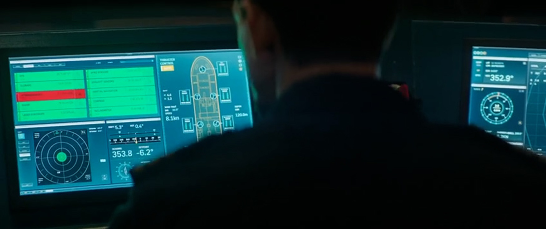
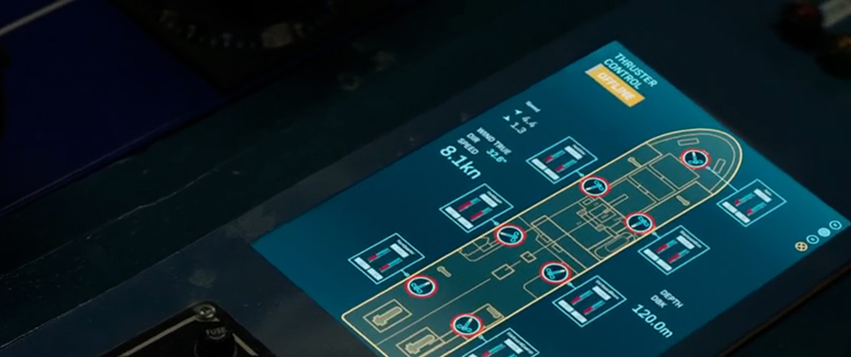
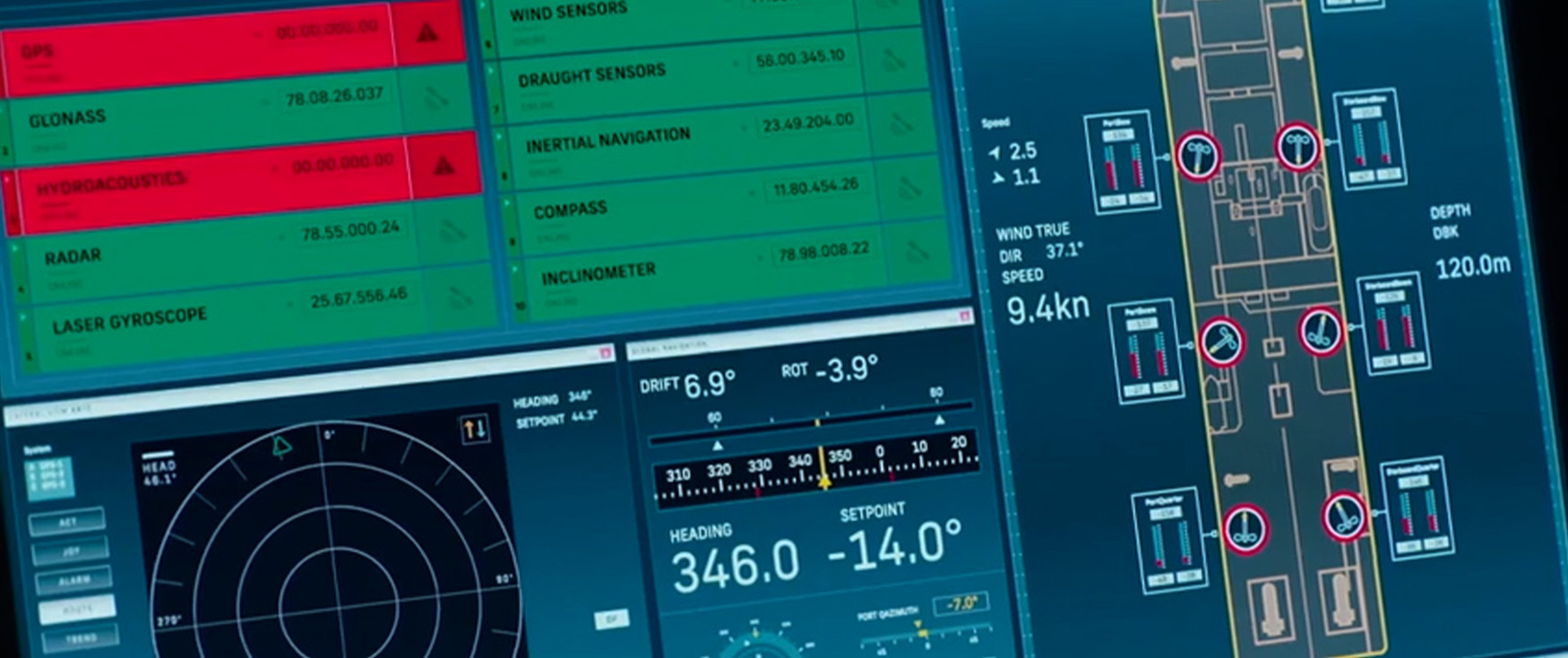
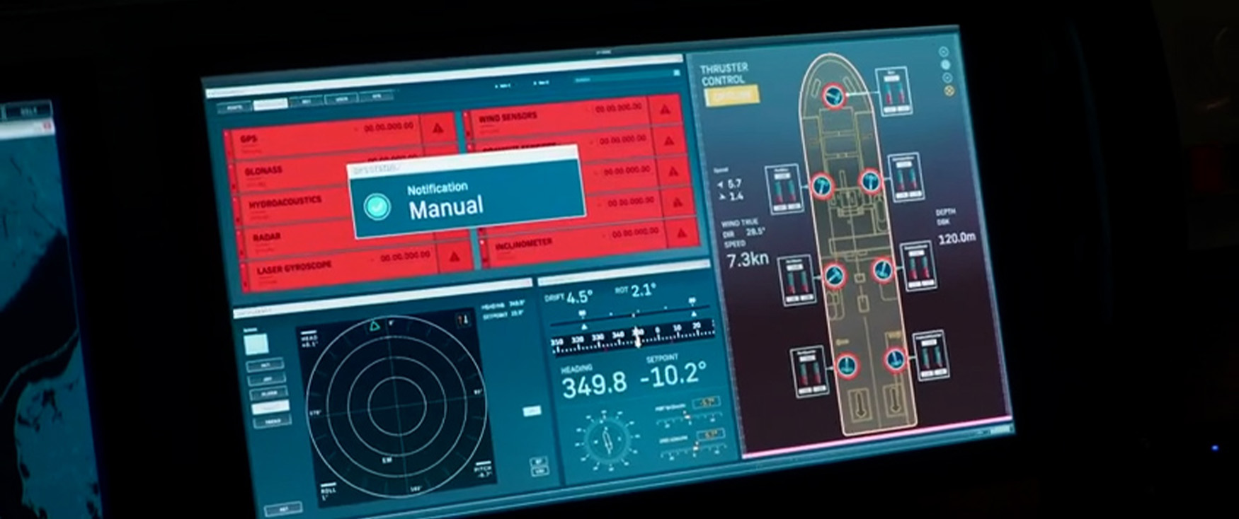
The bridge graphics were designed to deliver narrative clarity while maintaining authenticity. Displaying real-time data such as satellite connections, ship heading, rotation, and bell position, the visuals mirrored real ship instrumentation with a stylised edge. Colour coding (green for stable, red for failure) and clean layouts conveyed escalating tension as systems began to fail. Integral to the storytelling, the graphics provided a clear visual of the ship’s status, often cutting directly between interface and action as the storm intensified.