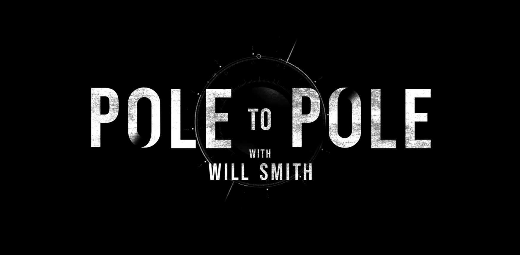
Final Title Treatment
The treatment and motion sequence are intentionally subtle, modern and abstract in design. The core idea was a modern take on a classic compass that calibrates to organically find its ‘true north’. Each character is revealed section by section, a deliberate typographic choice that visually mirrors the act of uncovering information and the broader theme of discovery. The ‘O’s in the logo feature missing segments at the top and bottom to represent the North and South Poles, symbolising the show’s journey from Antarctica to the North Pole.