USS Protostar
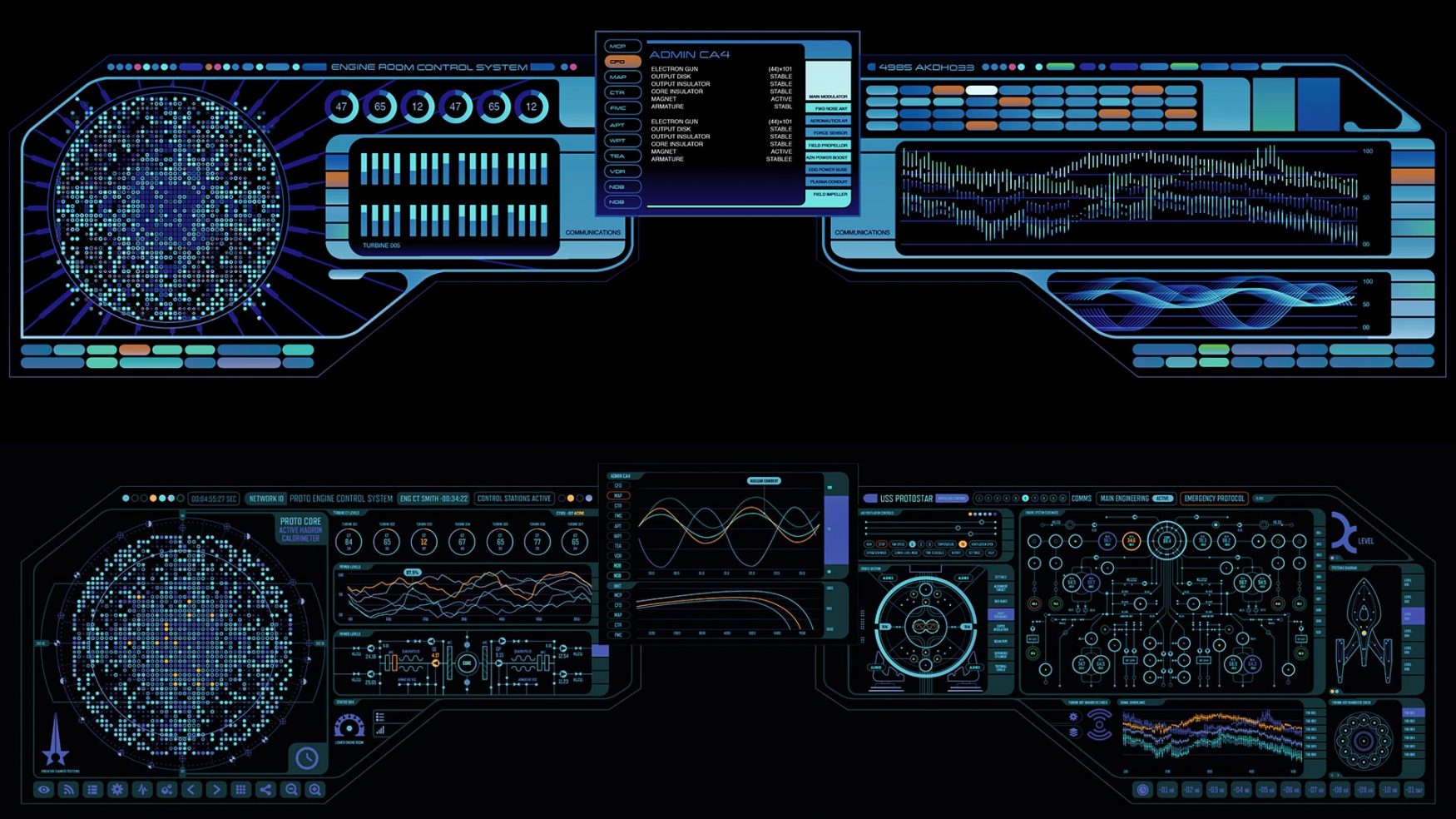
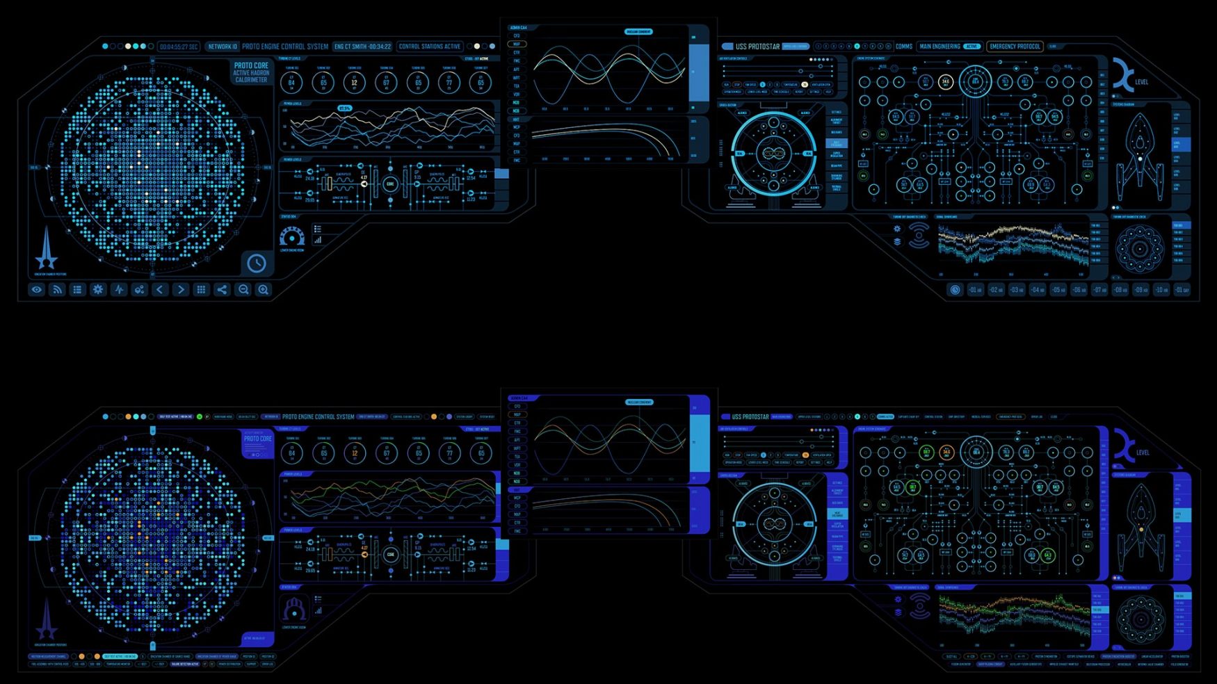
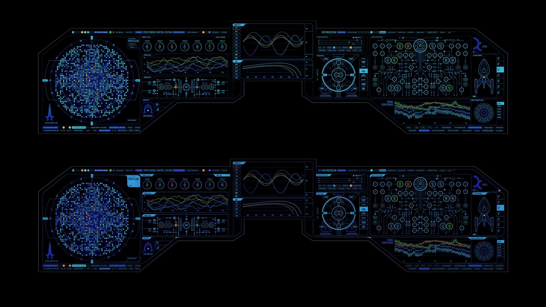
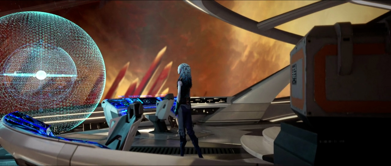
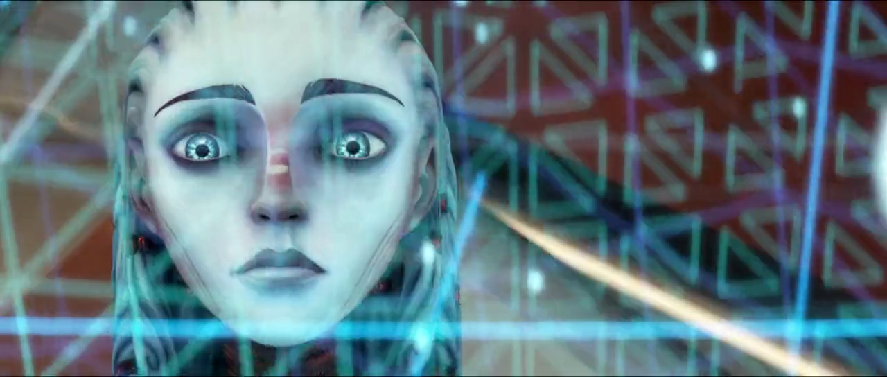
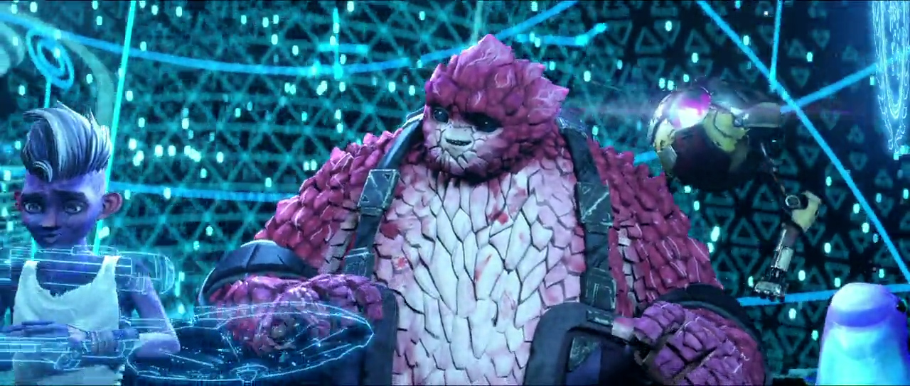
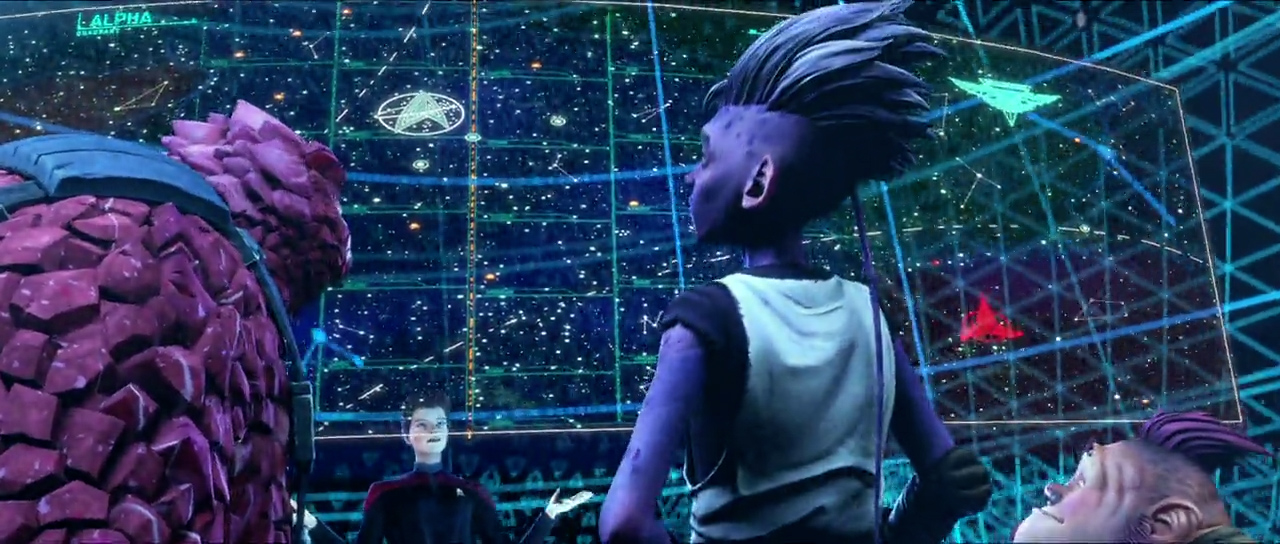
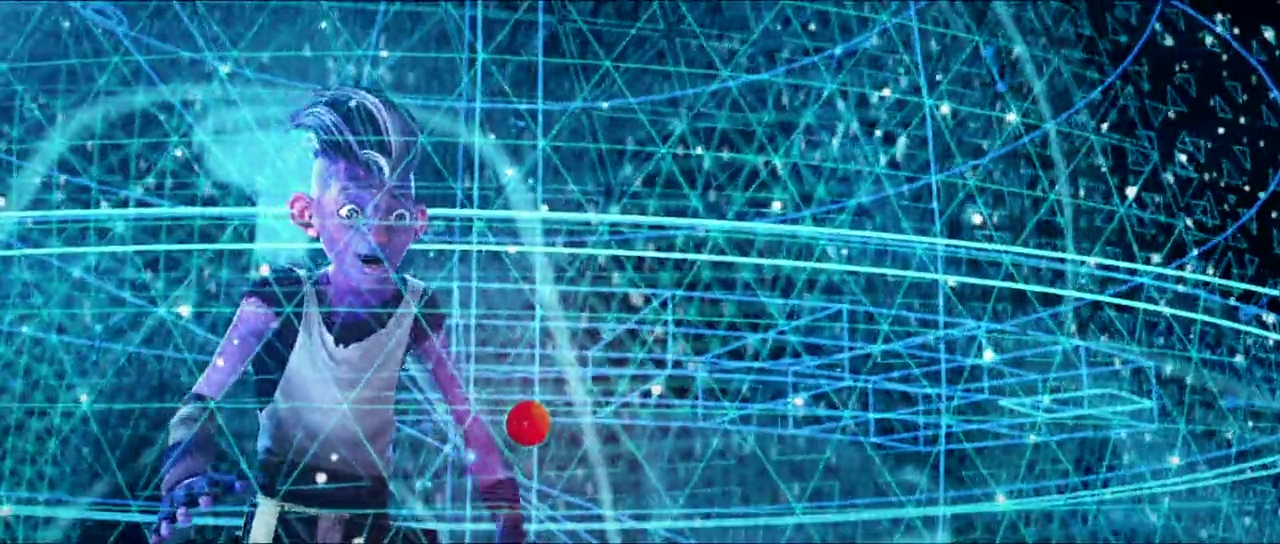
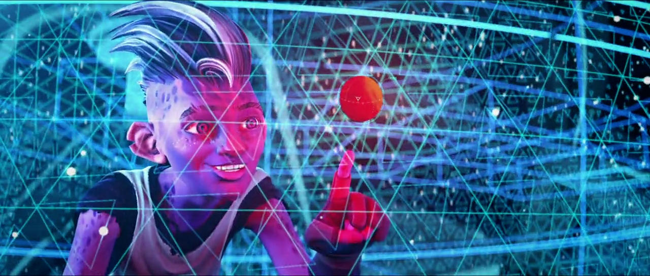
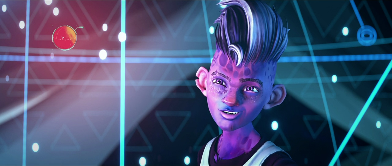
Every workstation in the USS Protostar has a specific function, so the challenge was to design unique UIs whilst ensuring a consistent aesthetic.
StarTrek: Prodigy, the first fully CG StarTrek series, is a new chapter to reach and engage new audiences.
Read MoreProduced by Kevin and Dan Hageman for Nickelodeon and Paramount+, the series is set more than 350 years in the future and focuses on six young aliens who take control over the abandoned USS Protostar and explore the galaxy.
First announced at the virtual 2020 Comic-Con @ Home event, Territory Studio was initially asked to design consoles inside the Starship Protostar for just one episode but went on to contribute assets and sequences to a number of episodes throughout the series.
Every workstation in the USS Protostar has a specific function, so the challenge was to design unique UIs whilst ensuring a consistent aesthetic.
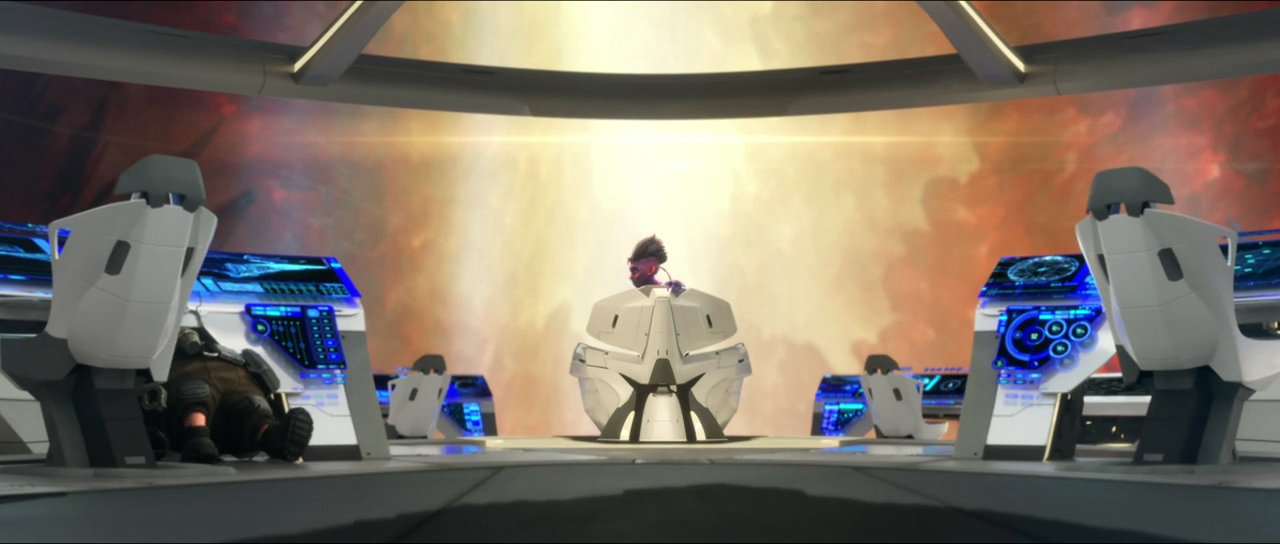
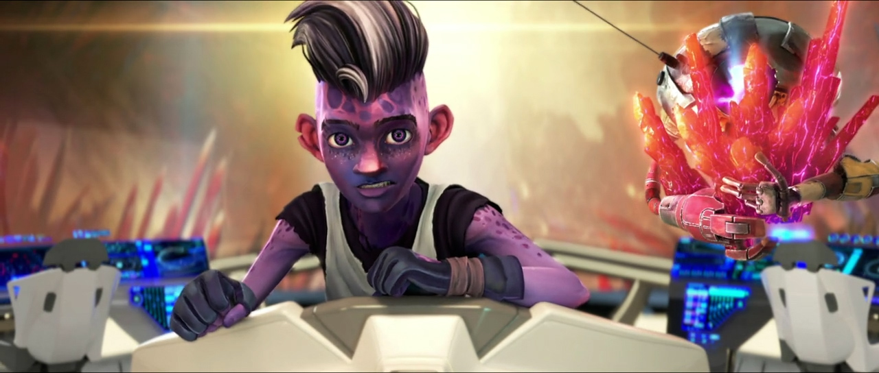
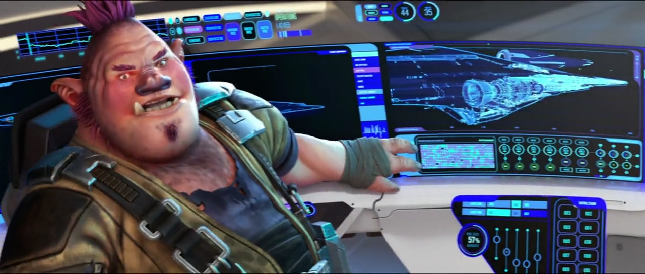
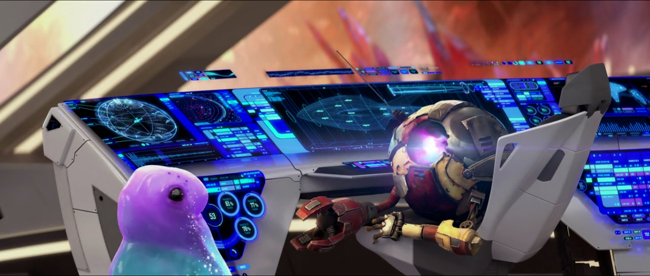
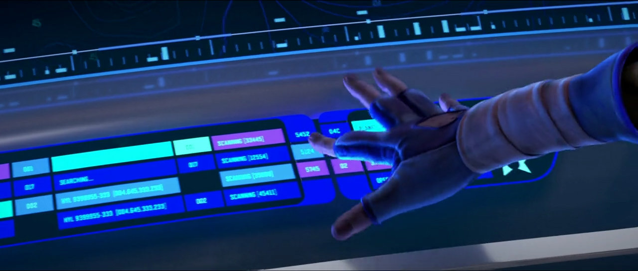
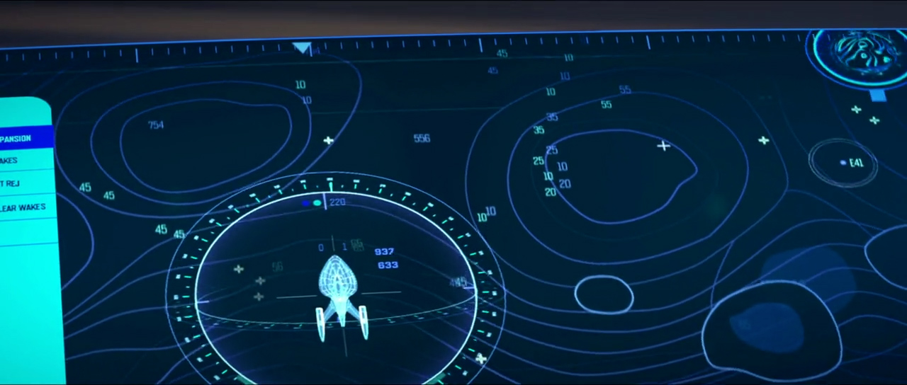
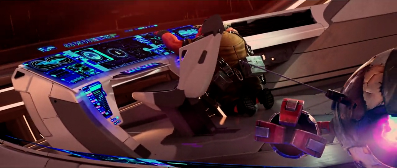
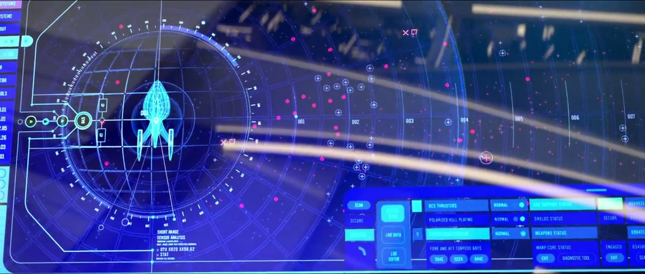
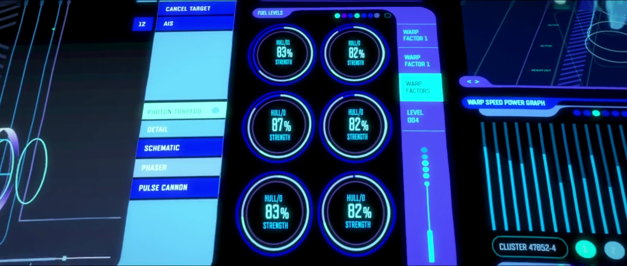
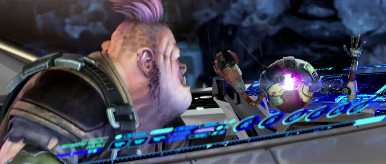
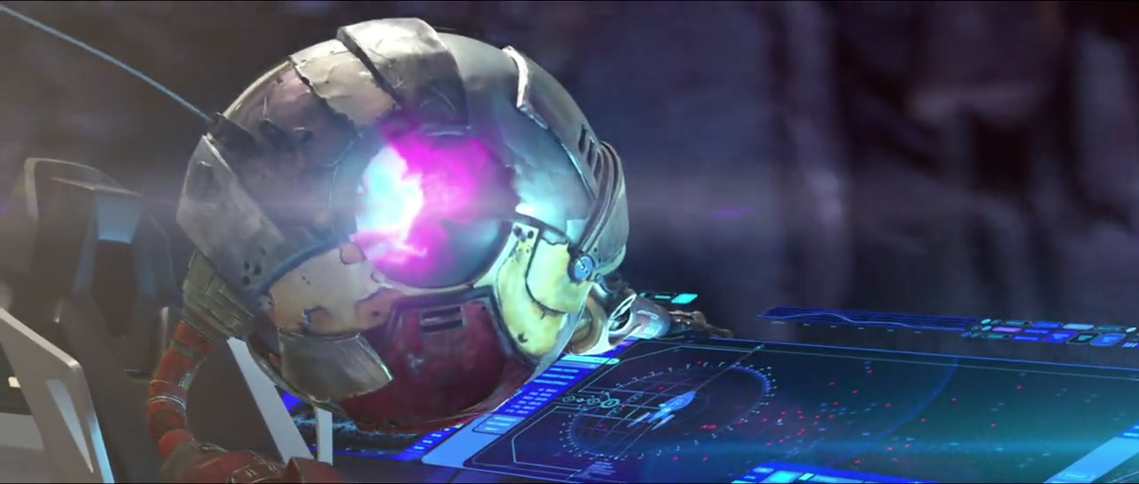
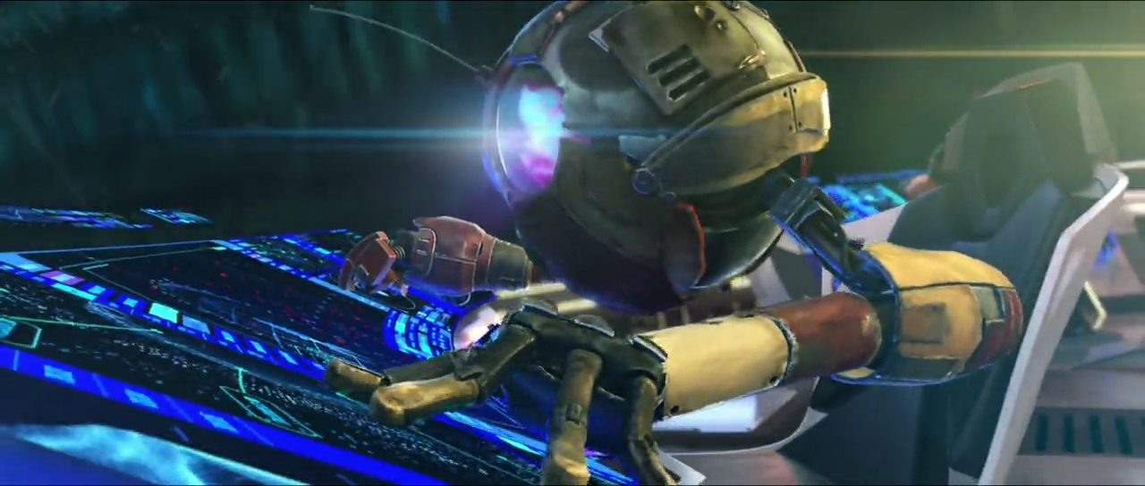
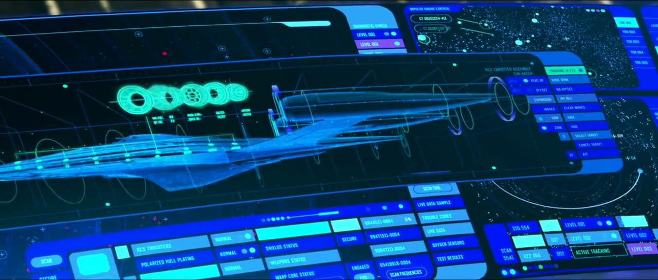
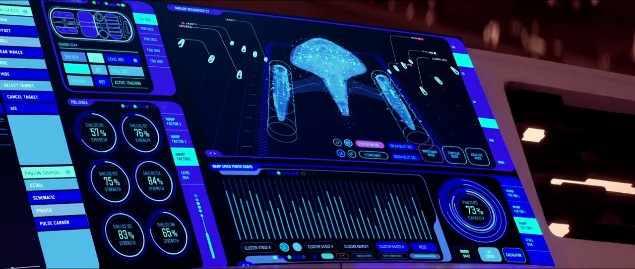
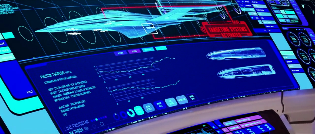
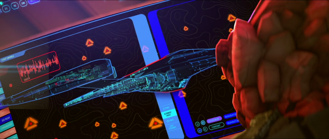
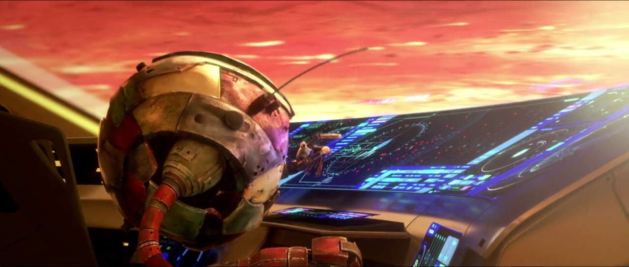
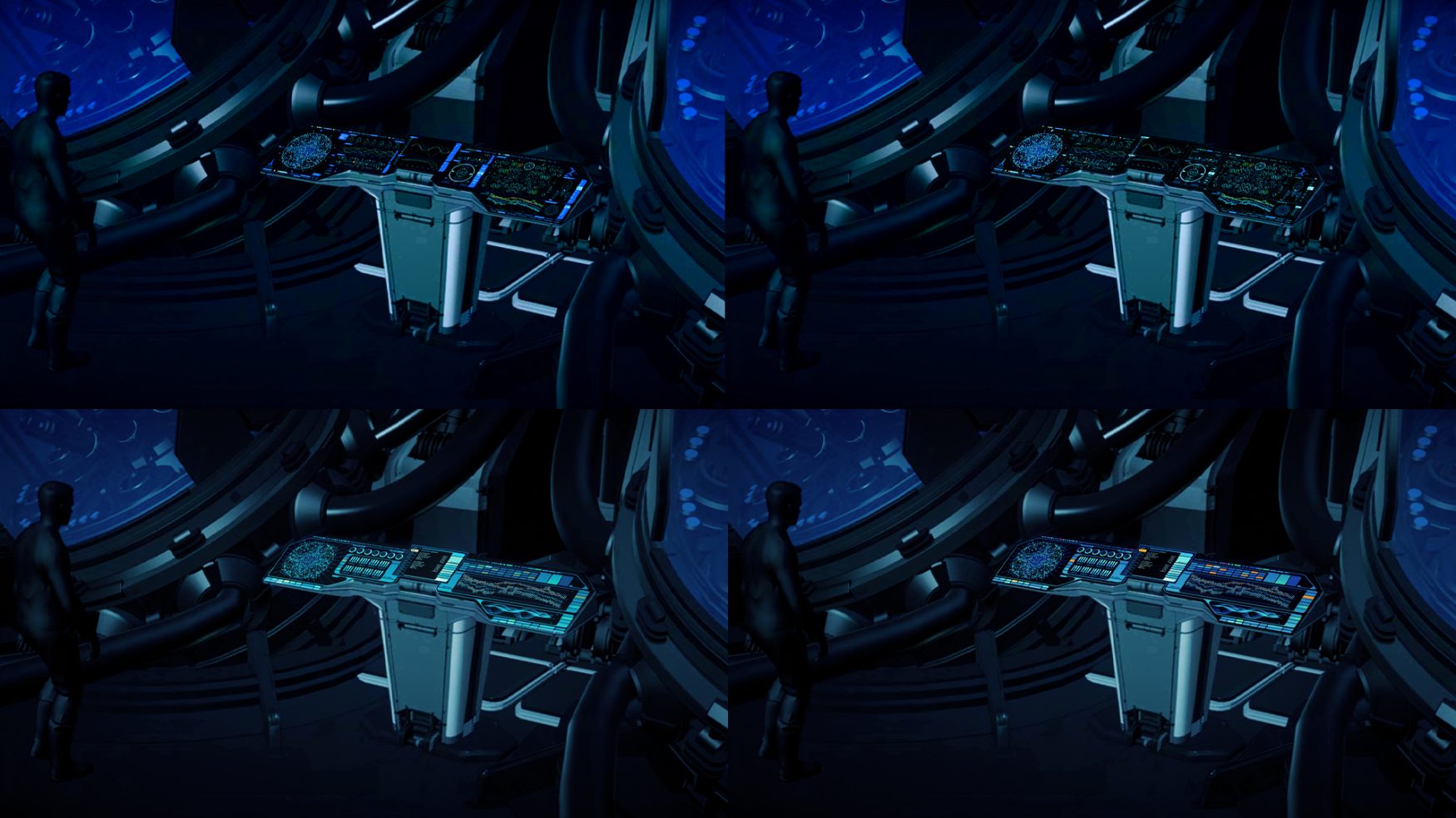
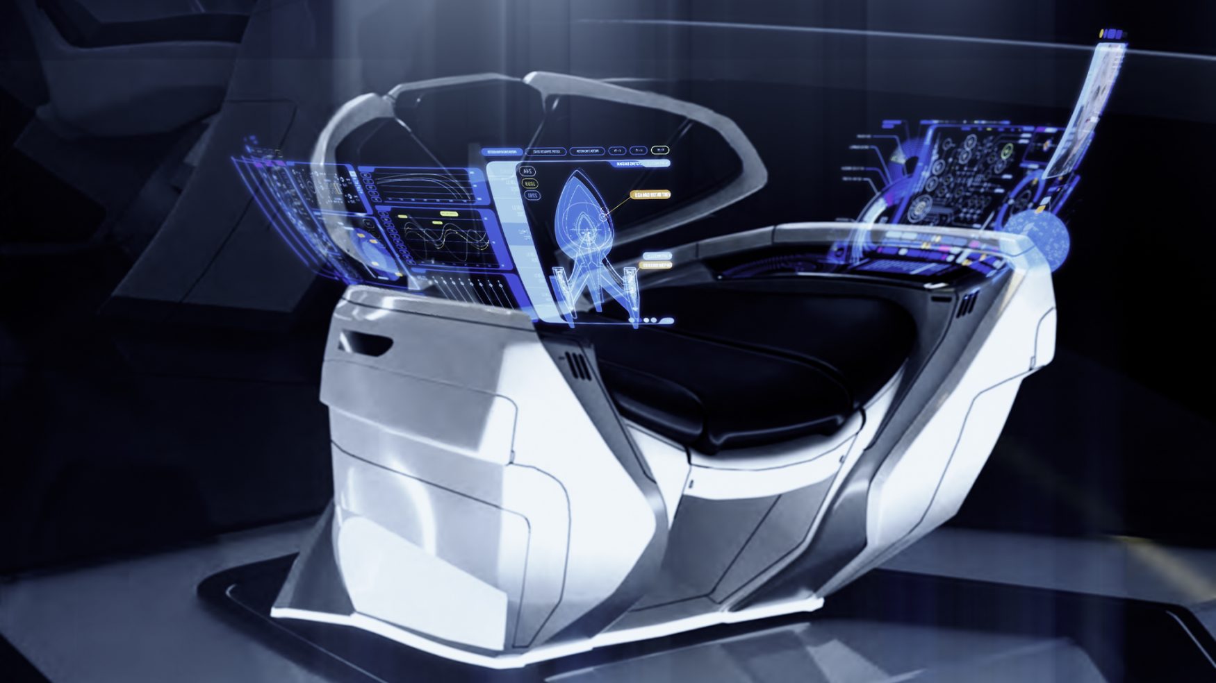
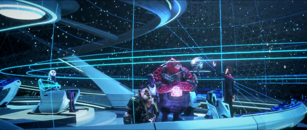
The Captain’s Chair interface is a holographic interface that curves around the chair, providing the Captain with a constant stream of information that is all within arm’s length.
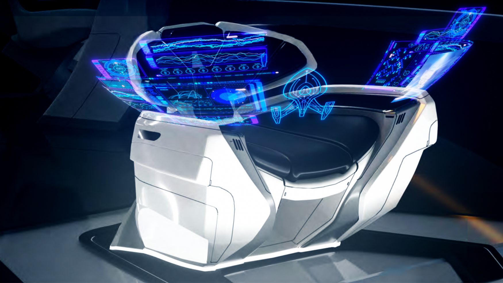
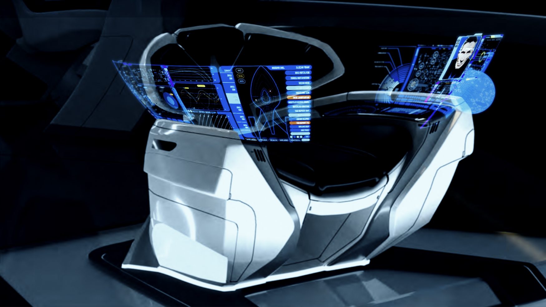
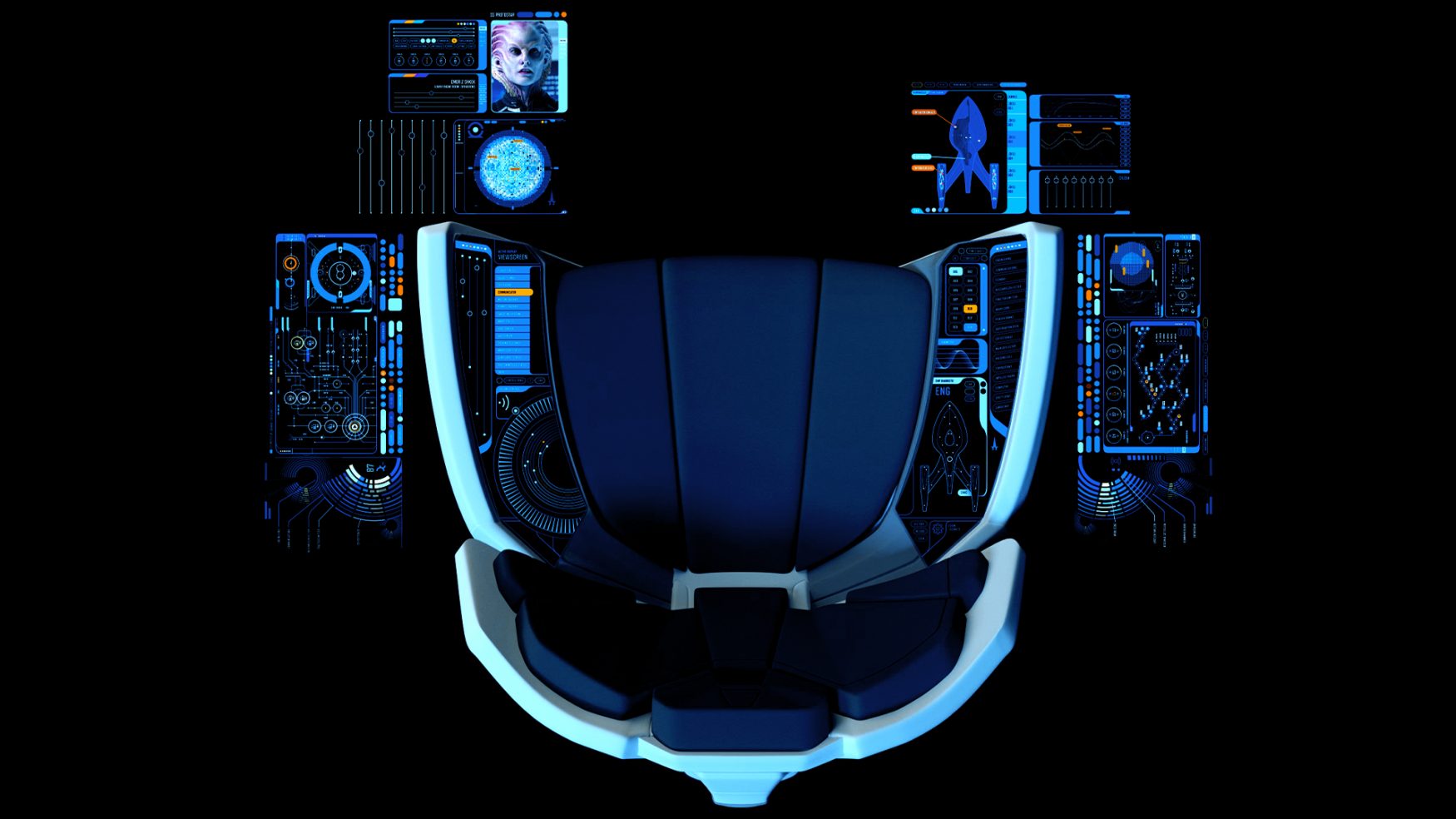
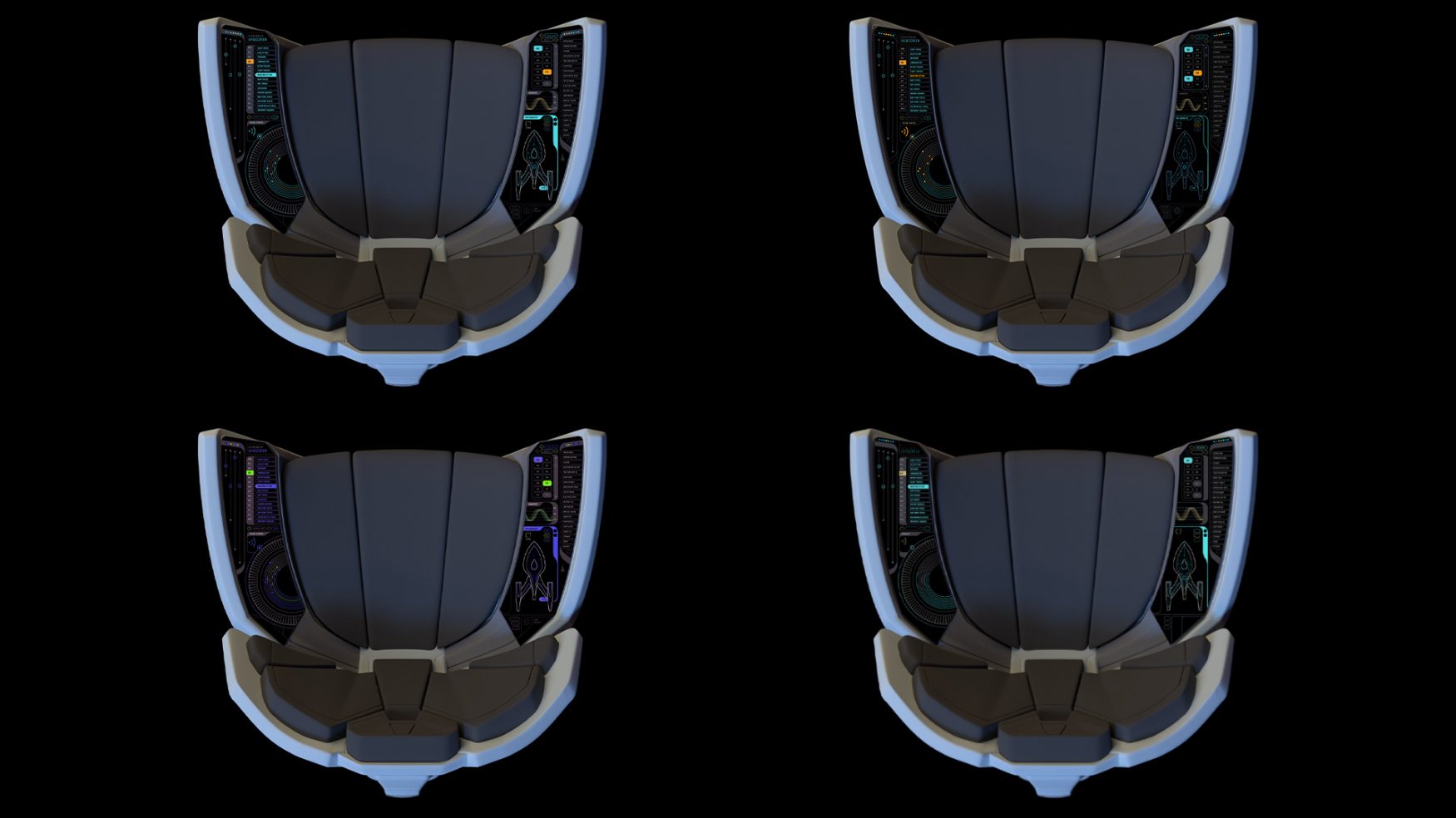
A key aspect of the Protostar Bridge, the navigation map was built as a modular asset that could animate ‘on and off’ and serve as a structure for graphics to be added to.
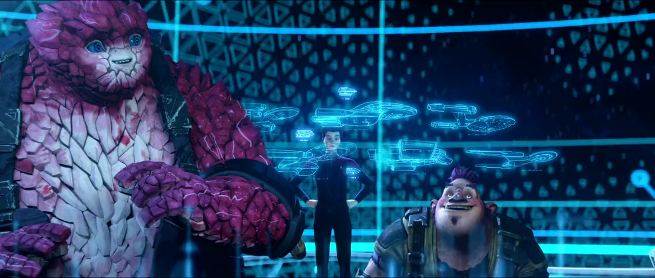
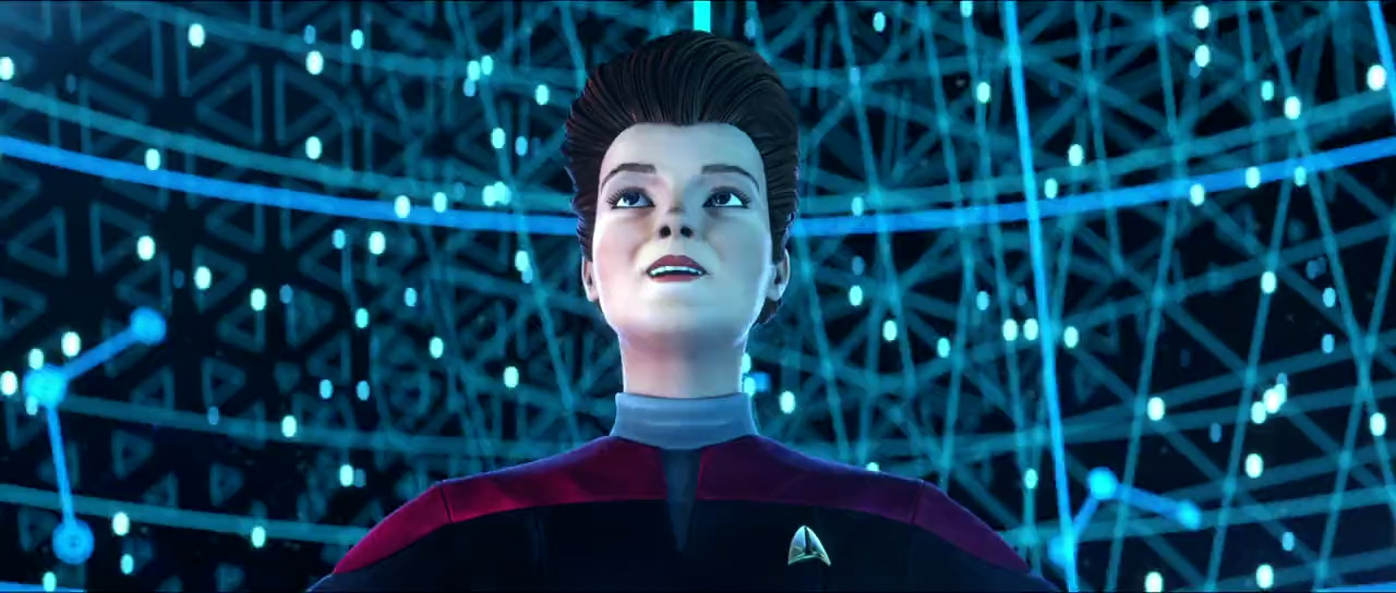
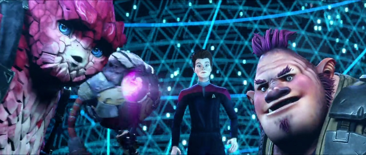
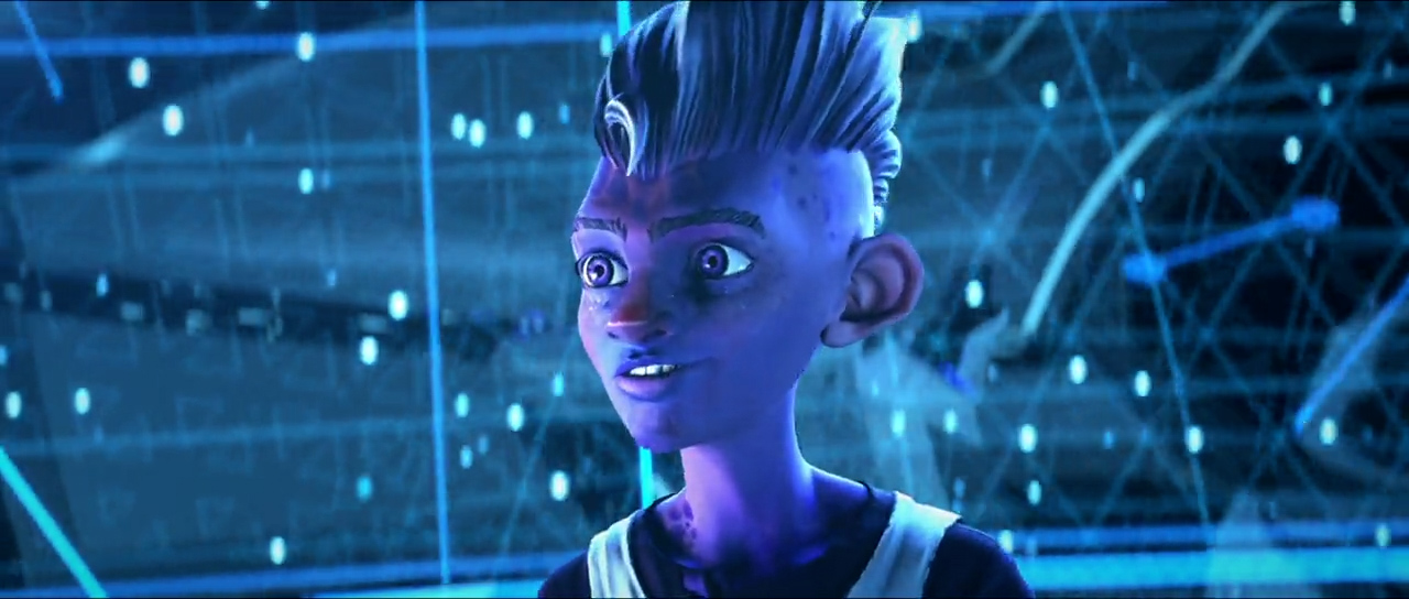
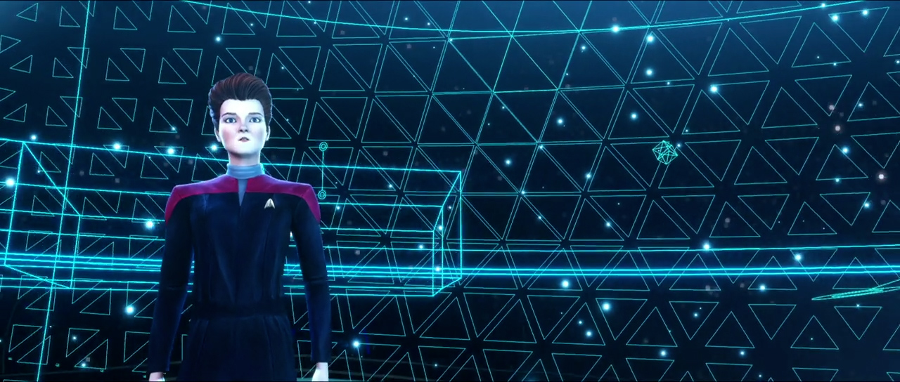
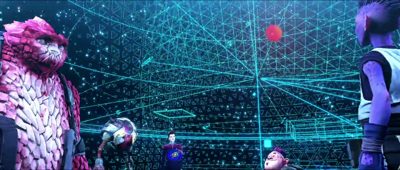
From the moment Ben Hibon showed us a collection of early concept art, it was obvious that “StarTrek: Prodigy” would be a unique and groundbreaking animated series. It was a pleasure working with Ben and his team.
Jorge Almeida - Design Lead at Territory Studio
Tars Lamora is an inhabited prison colony planet where Dal, the series protagonist must gather together an unlikely crew for their ship to escape.
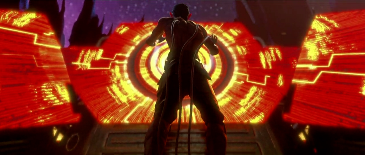
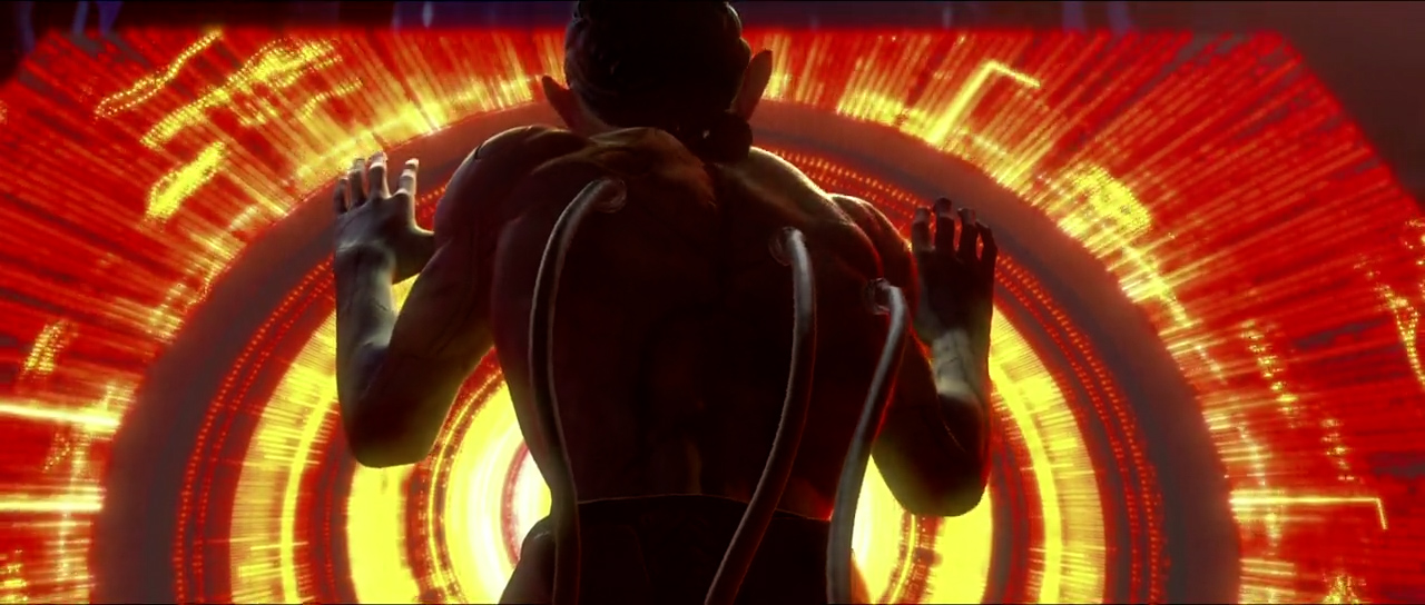
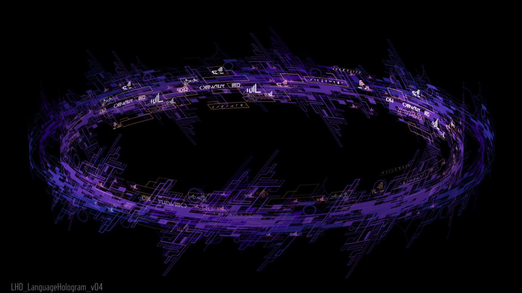
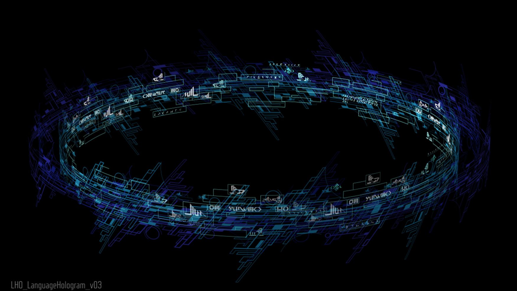
The divine console interface used by the evil alien ‘The Diviner’ on planet Tars Lamora had to stand apart from the screen graphics featured in the interfaces on USS Protostar. This interface need to be more abstract, more alien, and the design needed to compliment the disjointed graphic style of the Diviner’s environment
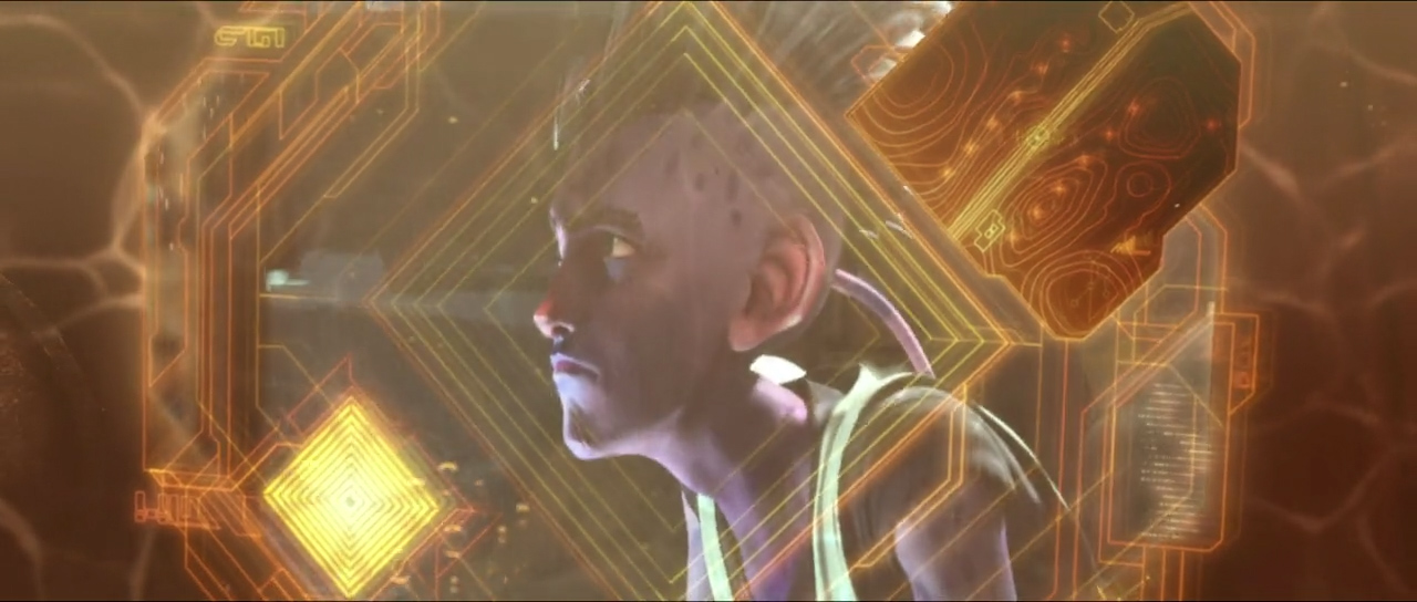
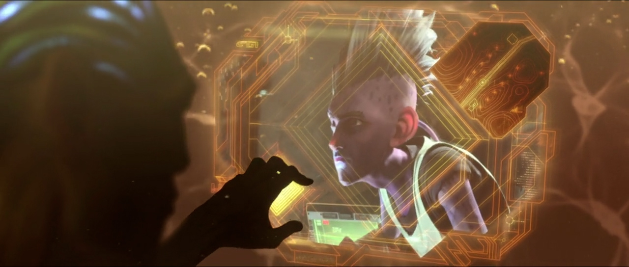
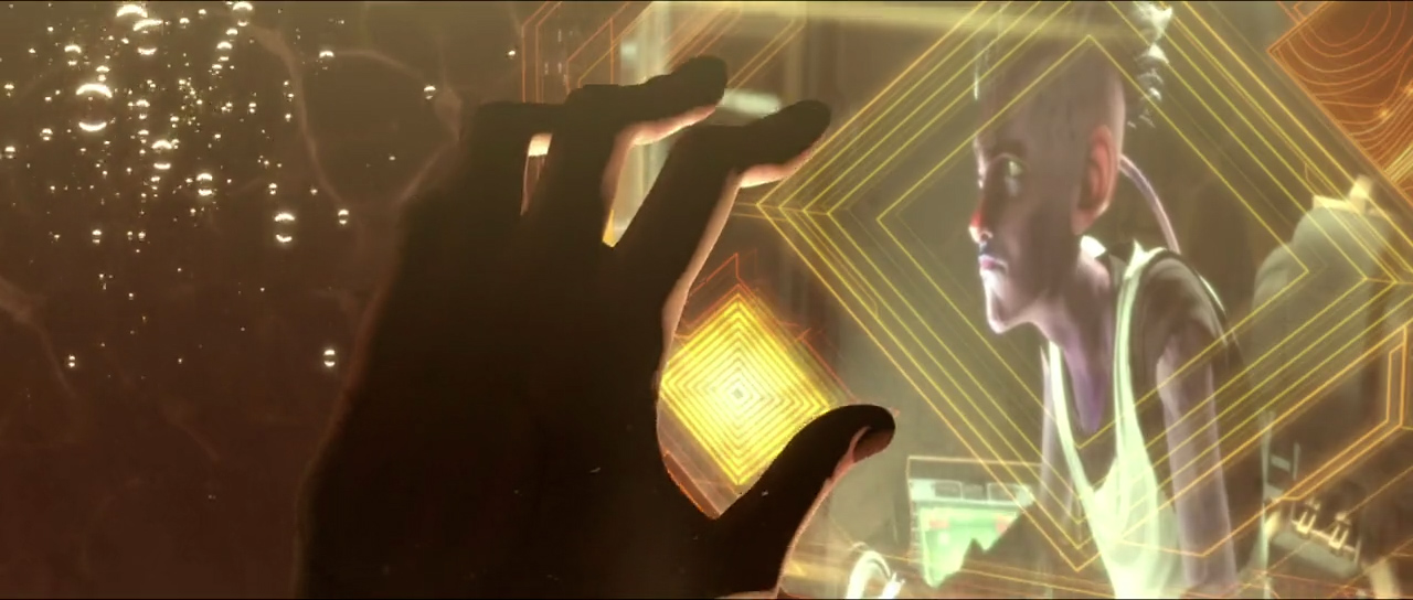
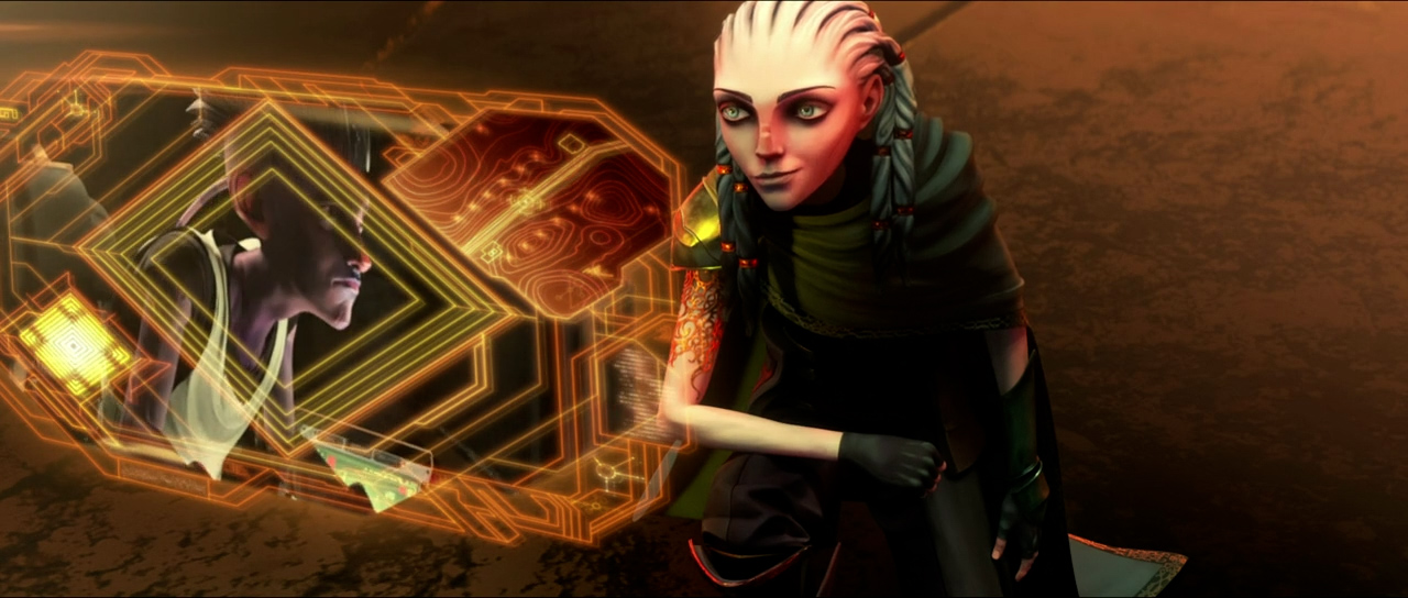
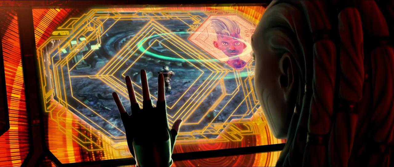
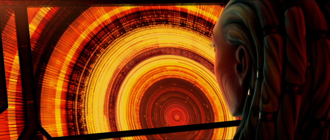
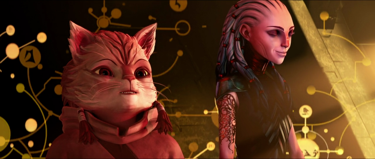
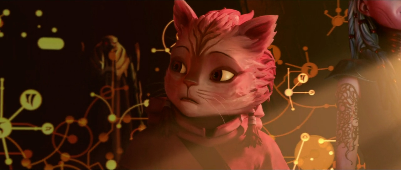
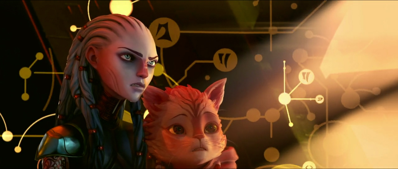
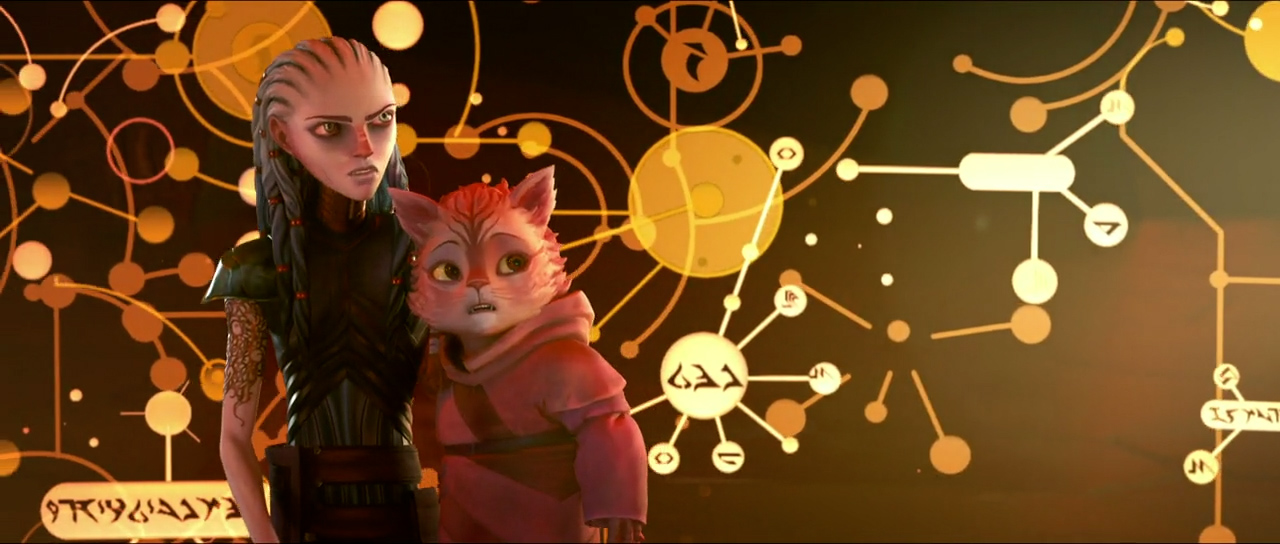
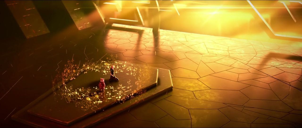
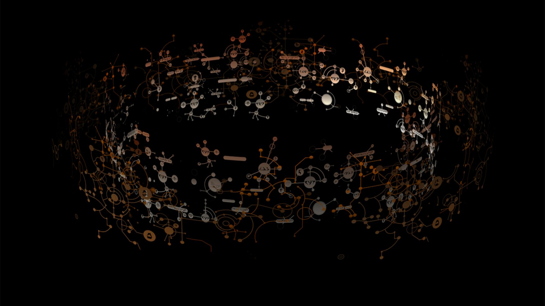
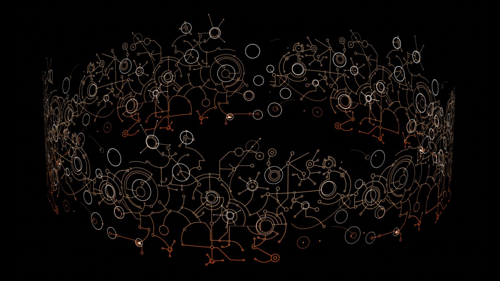
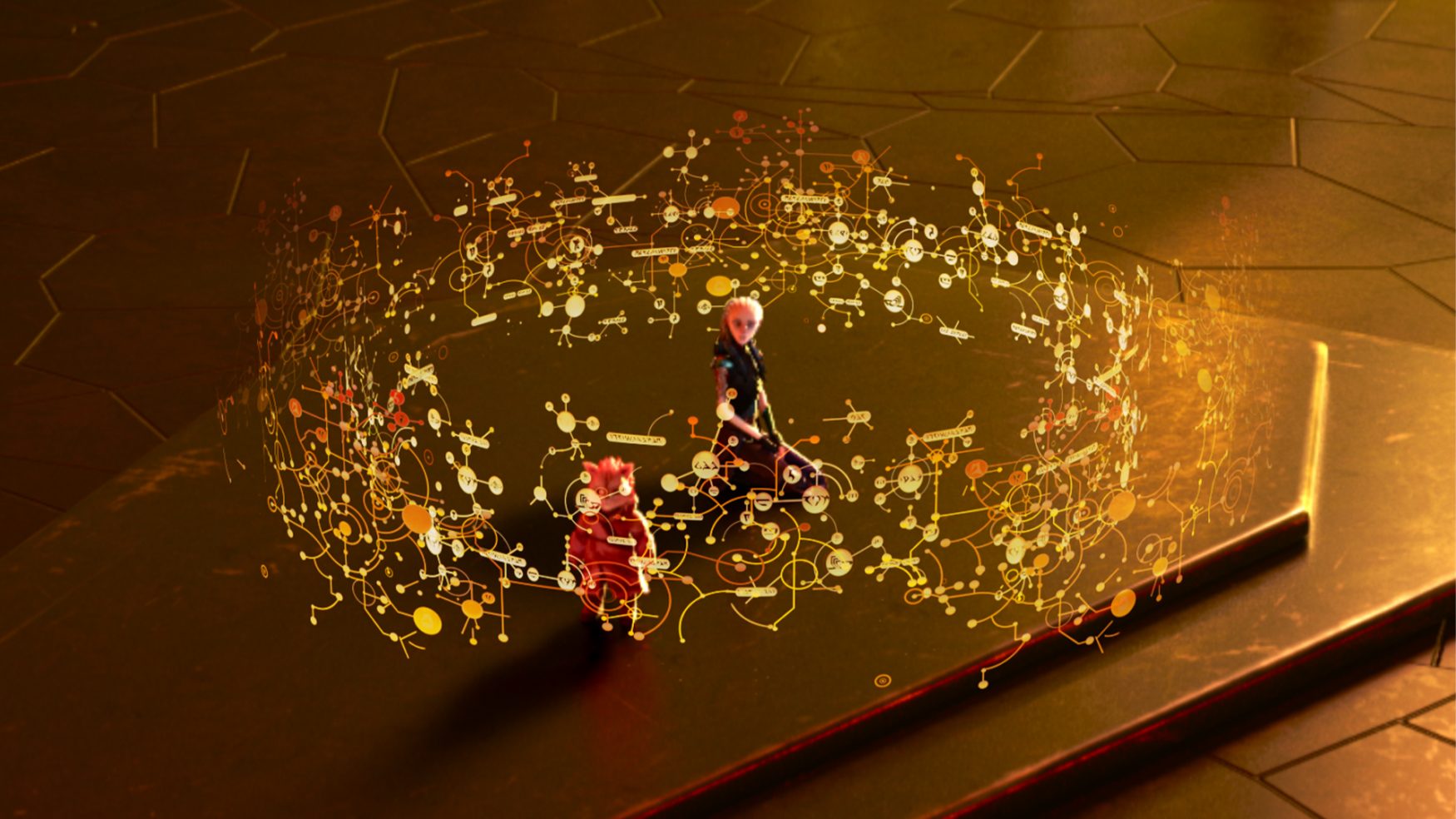
For these scenes, we were asked to create a hologram that was helping Gwyn learn the Klingon language. The goal was to make a hologram that felt ornate and sophisticated as well as alien. We focused more on a more recognisable syntax tree structure to help illustrate the function, then brought in the right amount of complexity so that it looked busy without looking cluttered.
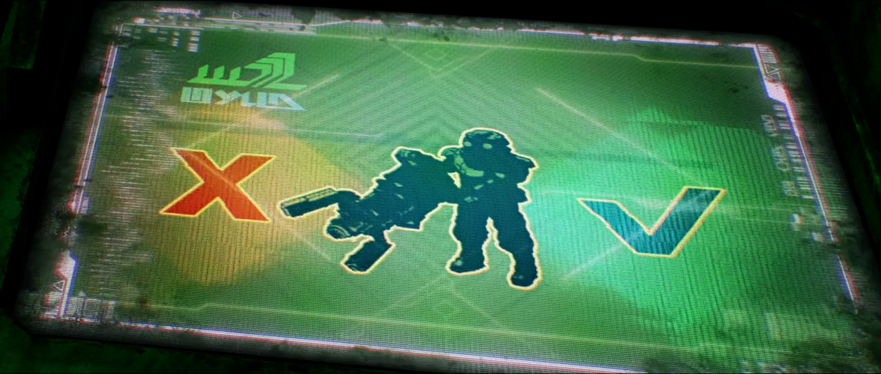
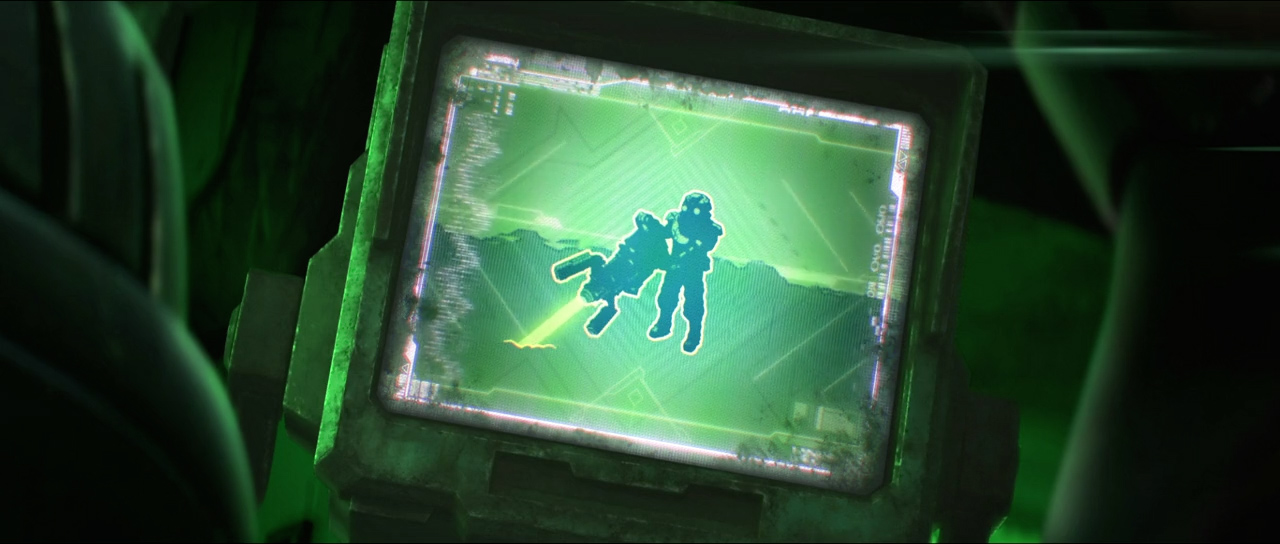
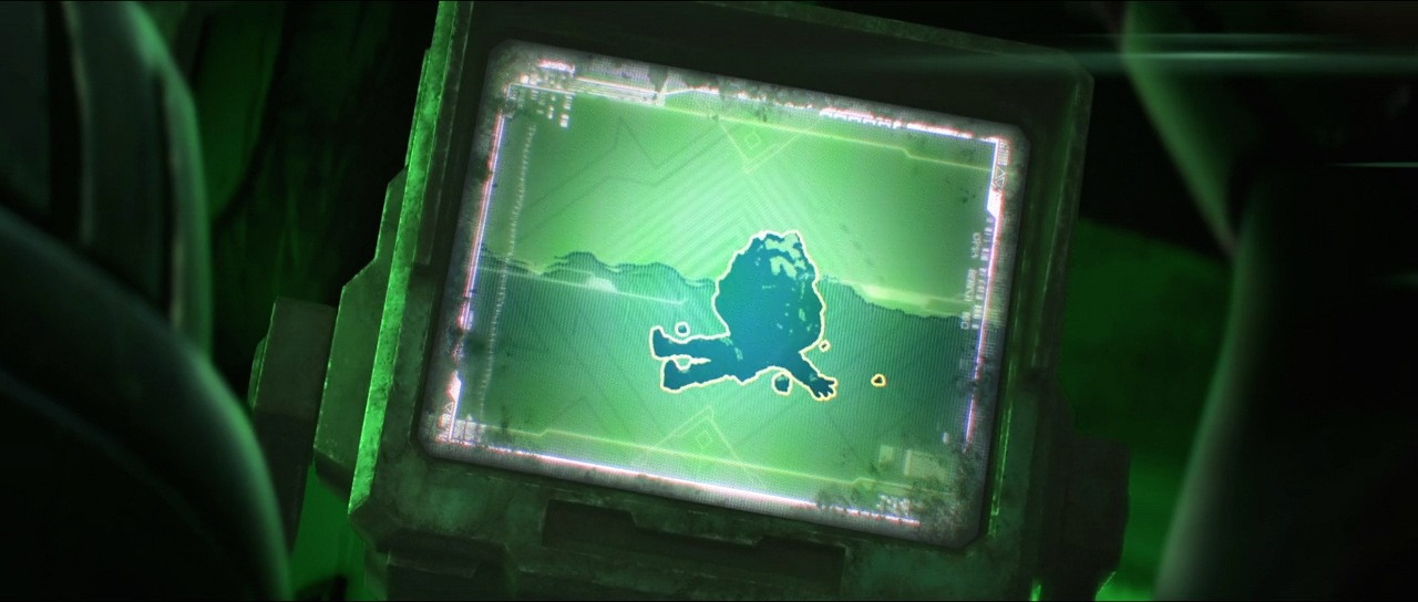
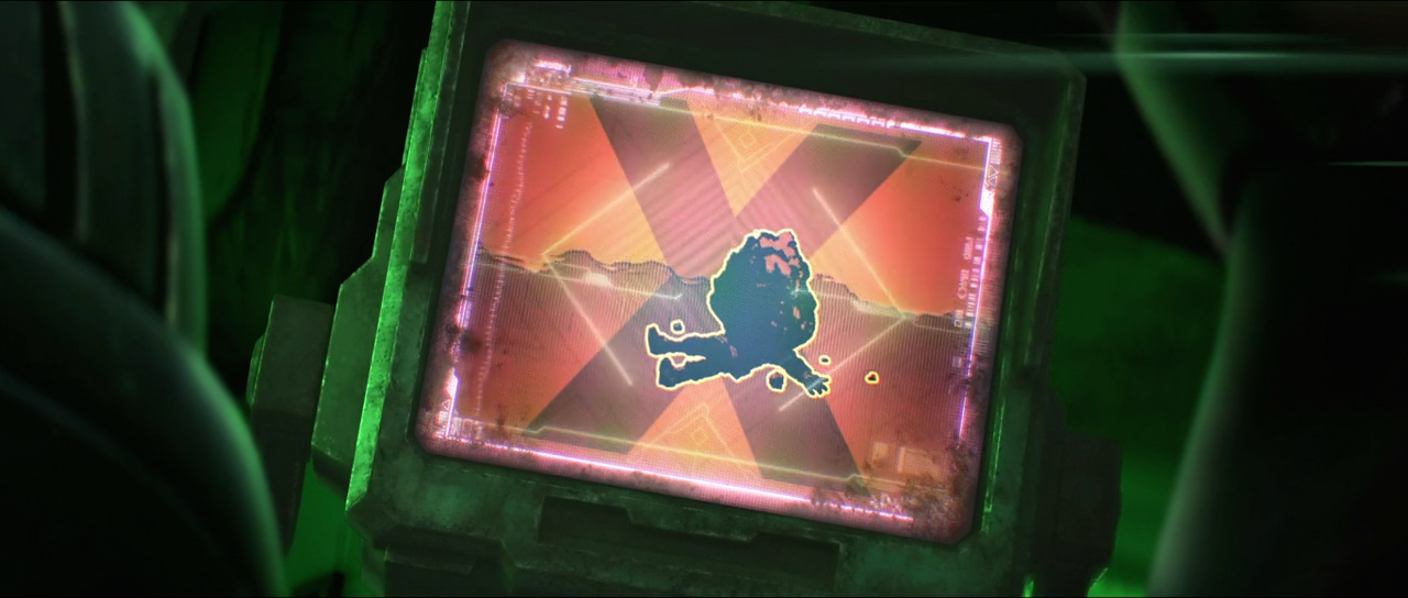
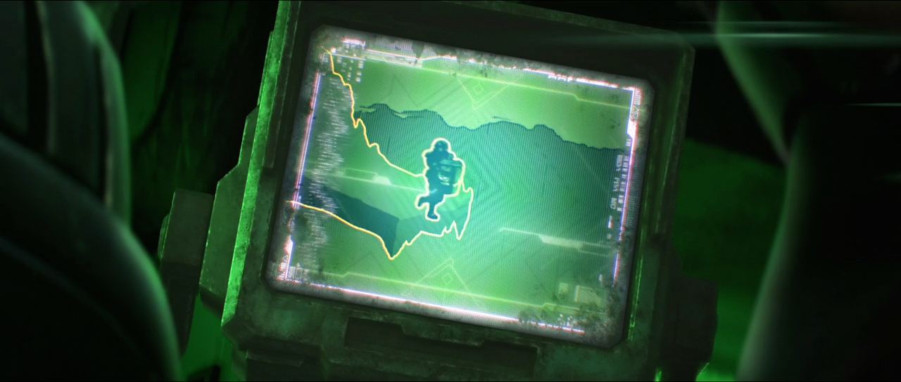
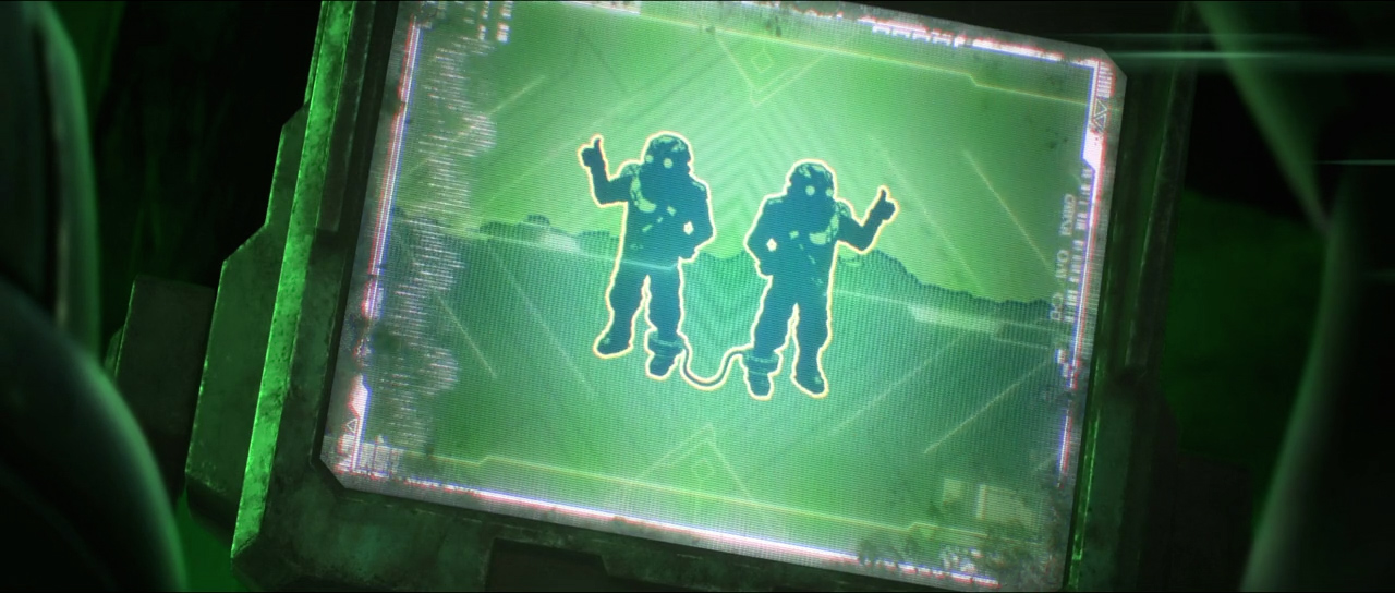
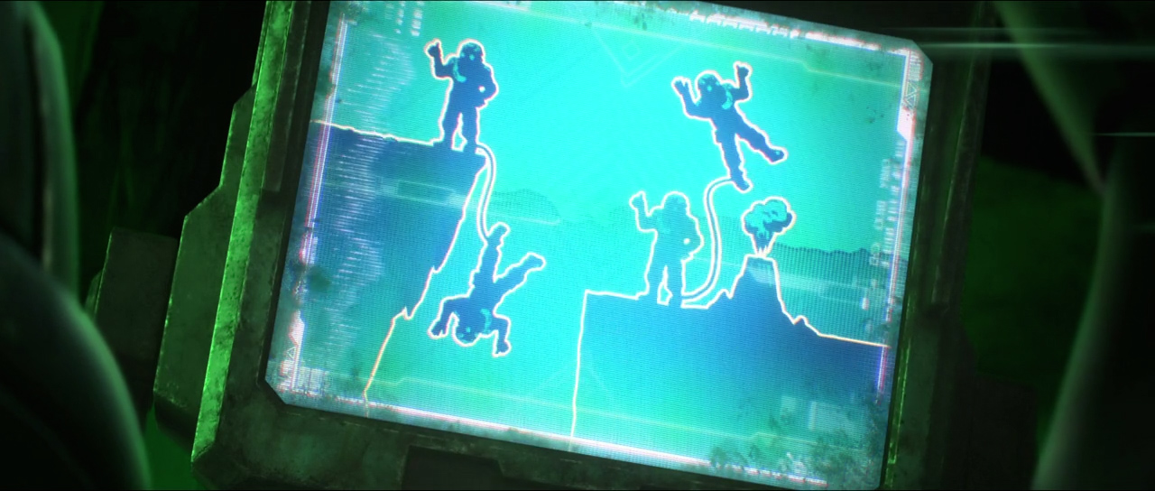
The safety video sequence was designed to give the feel of a traditional 1950’s-style corporate safety video while presenting this high-stakes work environment with comic absurdity.
