As creatives, clients and users, we are all surrounded by genre conventions. For good and bad, these familiar category short hands emerge out of initial disruptive chaos, through trial and error, to help us navigate quickly and easily. They are everywhere.
Colours, physical and virtual forms, signposting and interaction behaviours are all based on shared understanding and respect for convertions.
Think about how road signs and stoplights are designed and how the information is structured, and what red and green means for drivers and pedestrians. Notice that red, orange and green have been adopted into UI and even packaging design to alert users to certain types of information.
Brands also rely on conventions. Think about how brand names are contracted, shrunk down into logos, marks and icons ; all are small visual short-hands for the longer name. And now those print and signage conventions have been adopted online and on social platforms as thumbnails or avatar to represent a brand, even badge ourselves.
The same thinking applies to interaction design. Who doesn’t understand online UI iconography today? The ‘sandwich’ menu icon, the magnifying glass that invites us to ‘search’, the cog that means settings… Beyond that, we are all familiar with the swipe action on tablets, the ‘make smaller’ pinch, the enlarge …
Designed to help us, why do brands and creatives try to ‘break’ these conventions?
Marti Romances, Creative Director at Territory’s San Francisco studio explains, “The drive to innovate is partly driven by the need for brands to stand out from the crowd, to offer something new or unique. It’s also driven by our creative curiosity to find other ways, better ways to express an idea or engage with the world around us”.
This constant drive towards innovation is primarily thought about in the context of products and services. But, as Marti explains, it effects UI and UX design as well.
“Incremental innovation, as we think of it in UI and UX terms, tends to reference conventions, evolving familiar expectations and behaviours in a way that the user is comfortable with. Think Apple’s original skeuomorphic Graphical User Interface design, launched in 1984, which helped us navigate our computers by presenting computing logic using everyday visual icons. This in no way suggests that the innovation was less than radical — Apple’s GUI caused a paradigm shift in User Interface design, but it felt familiar”.
In the same vein, Marti shares how radical product innovations often ask that we change the way we interact, and learn new behaviours. Think the iPod click wheel. Revolutionary at the time, the click wheel transformed the actions we associated with gadget interfaces. Today, VR — a technology that will ultimately transform how we engage with the world around us — is going through a process of defining ways for users to interact with new and richly textured expereinces.
The field of speculative design encompasses imagined and conceptual products, services and interaction behaviours that go beyond our current technological capabilies. While they may reference conventions, they offer a new perspective on how we engage with the world around us.
“Territory’s heartland is innovation, says Marti, “and we’re passionate about it — incremental, radical, speculative and probable — the studio work on projects across all of these areas, and each one has its own challenges”.
Marti Romances
The studio’s speculative work is most readily seen in their fantasy UI for science fiction films, where spaceships, weapons and gadgets are used by humans, aliens and cyborgs.
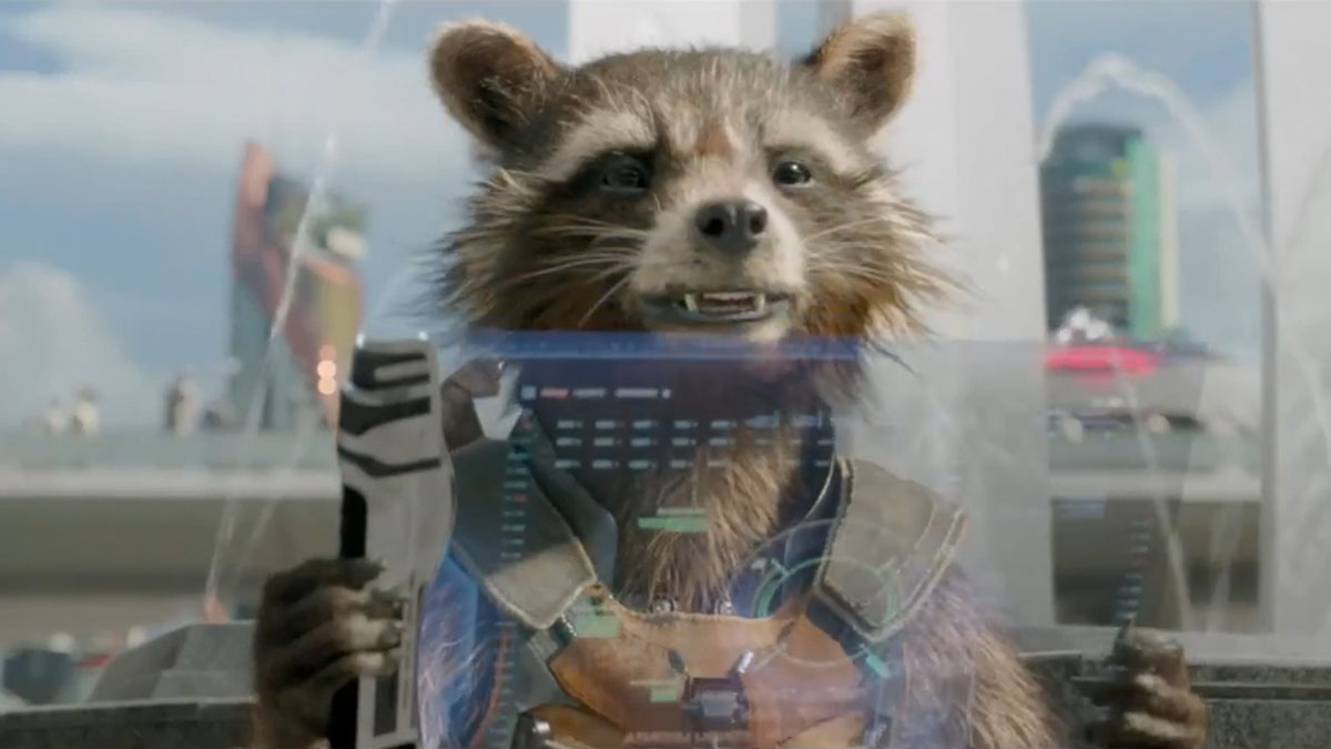
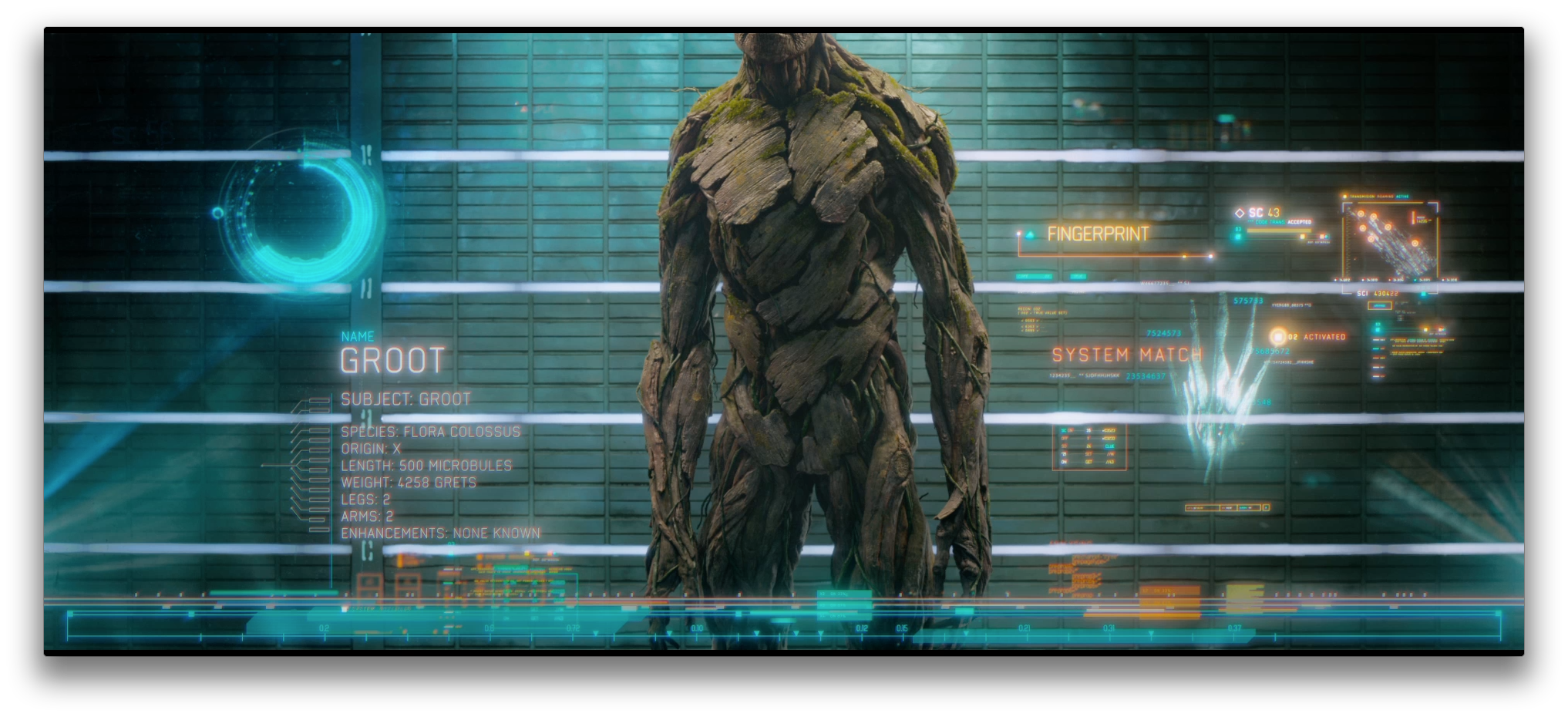
Speculative briefs allow us to imagine and visualise futuristic technologies. Guardians of the Galaxy is a great example of how a brief allowed us to explore interaction design for different life forms, like Groot a tree, or Rocket a racoon. Their ‘hands’ force us out of conventional thinking and makes us consider how they can credibly ‘interact’ with technology in the film. This often leads to more intuitive ideas that we can explore in the context of the story. And the beauty of this type of speculative design is that it can inspire more intuitive design for real world products that benefit users of all levels of experience.
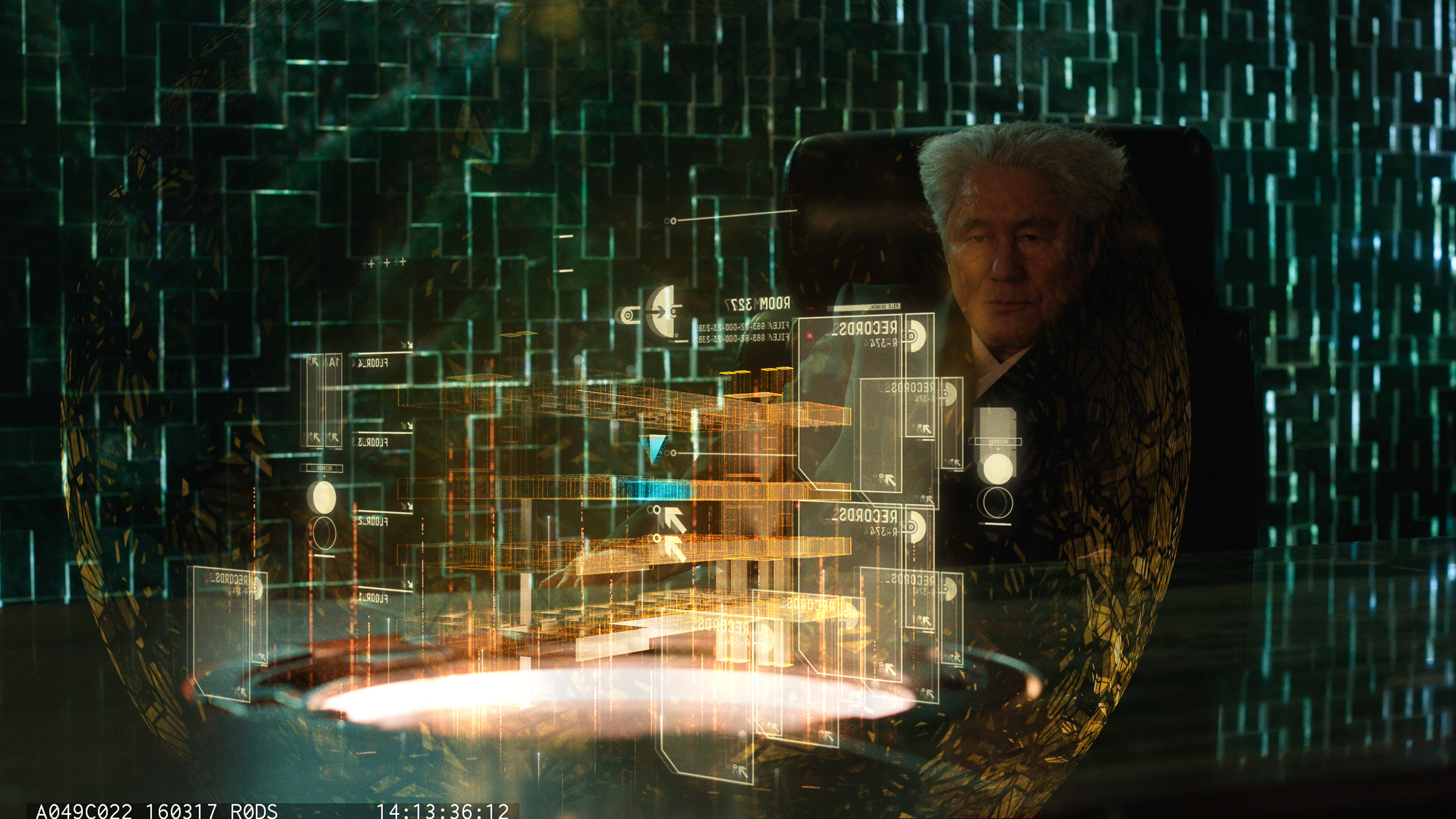
Speculation also allows the studio to investigate futuristic technologies like holographics. In Ghost in the Shell, the team devised visual and interaction systems that don’t yet exist, but may do in the next 5-15 years. Says Marti, “This is an incredibly exciting place to be working in as we’re essentially visualising products of the future, and helping to shape audience and consumer expectations of what technology might look and feel like”.