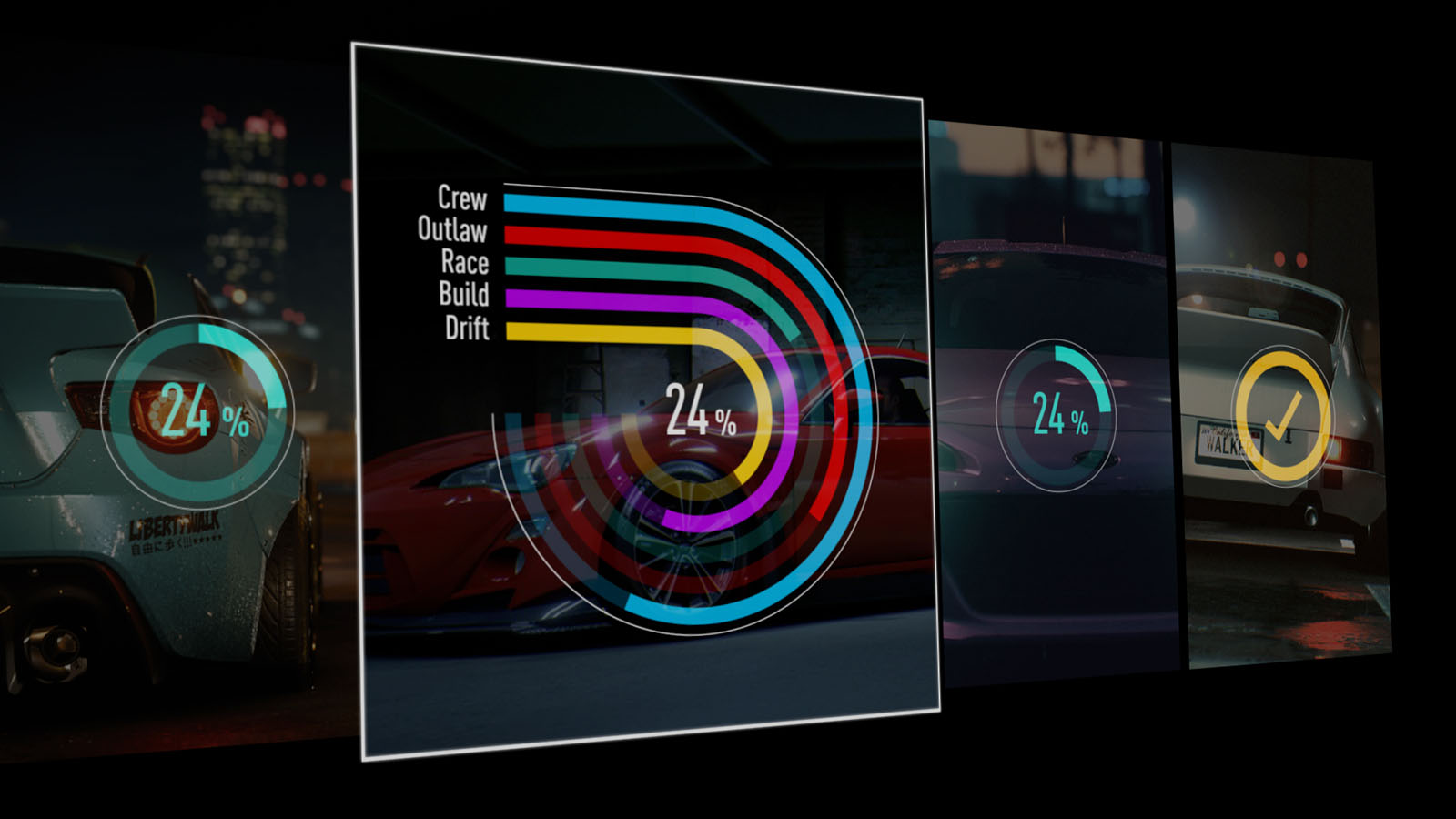
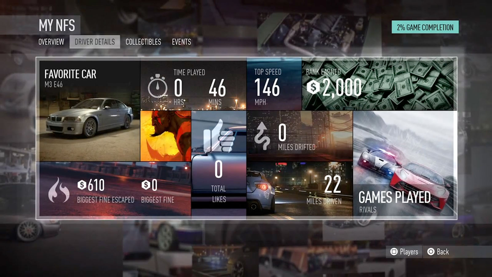
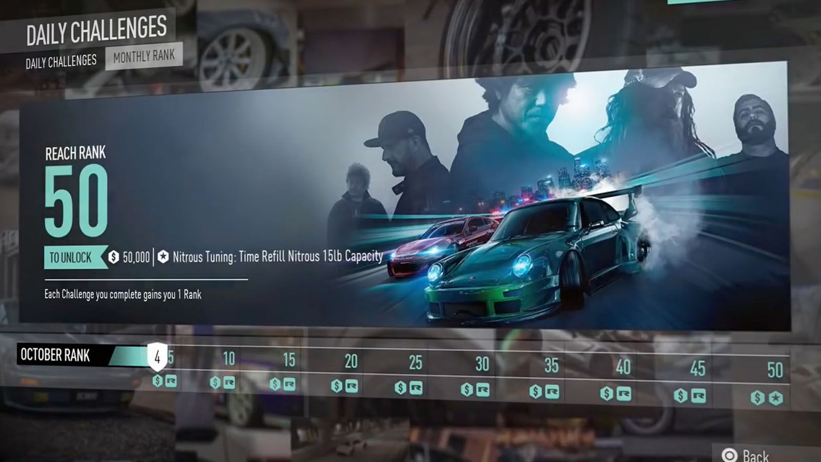
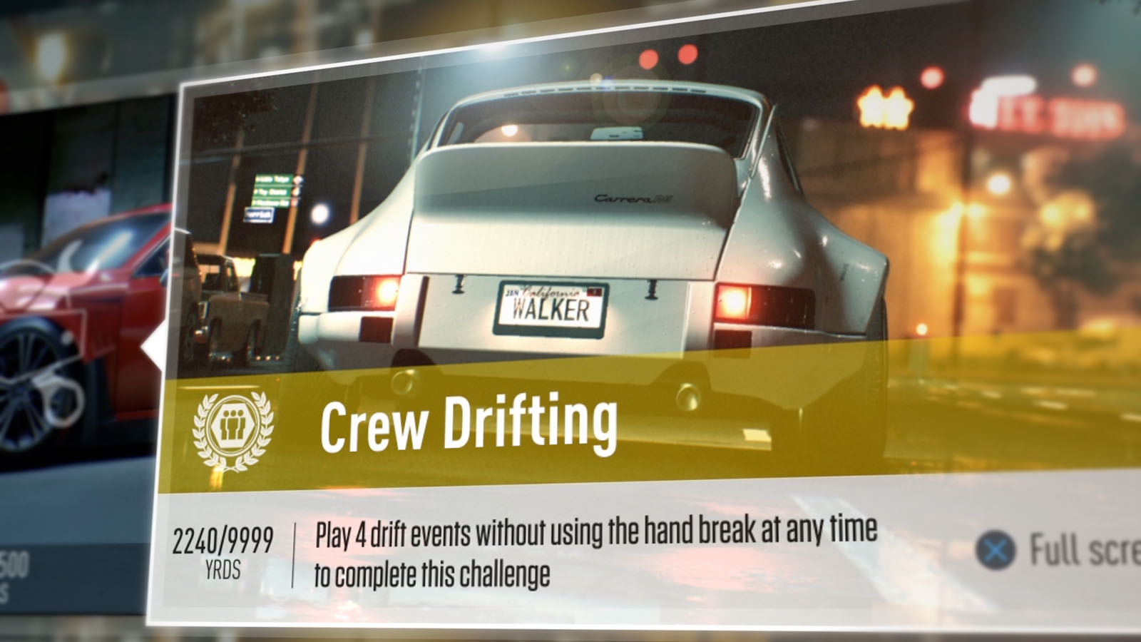
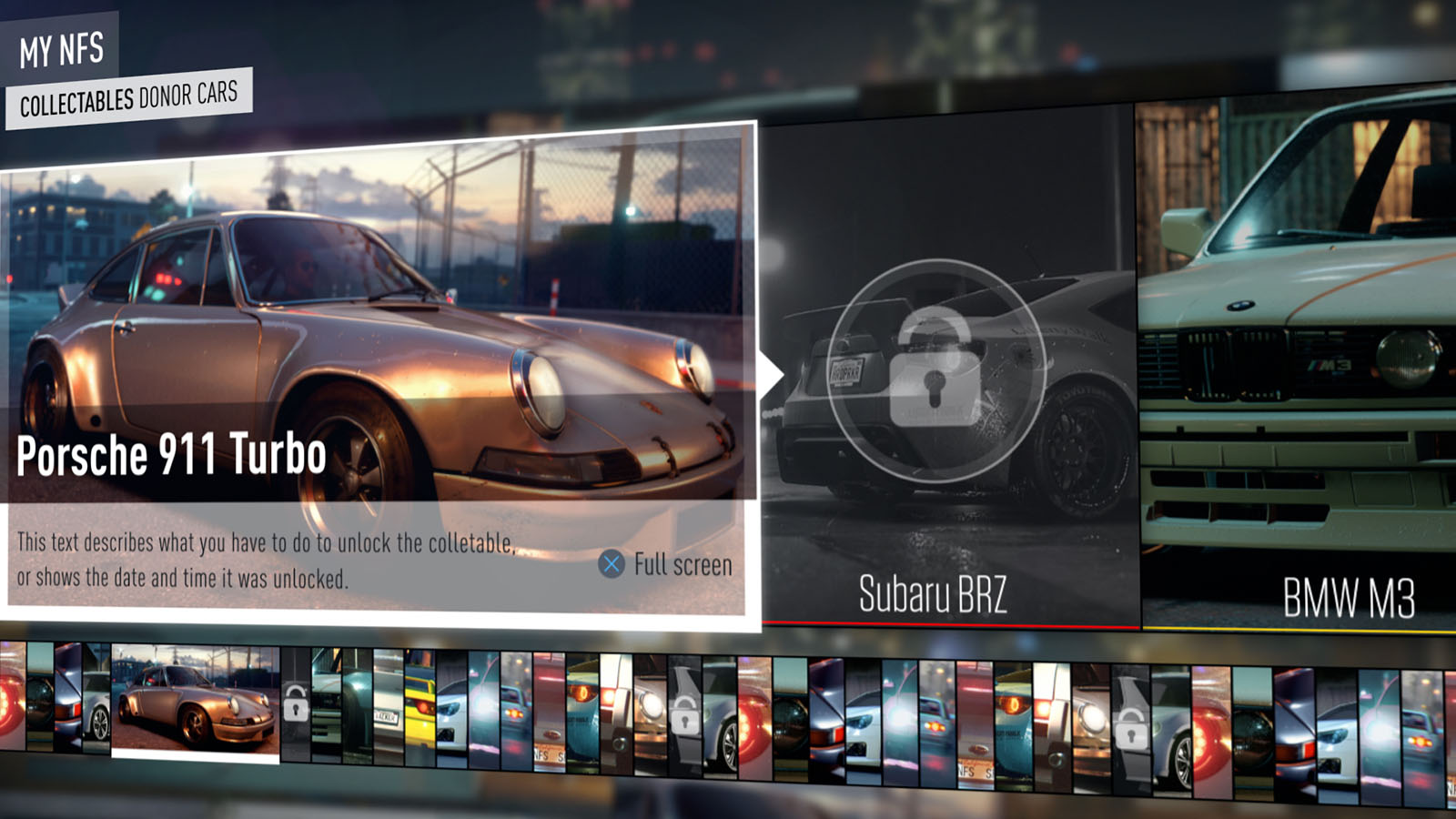
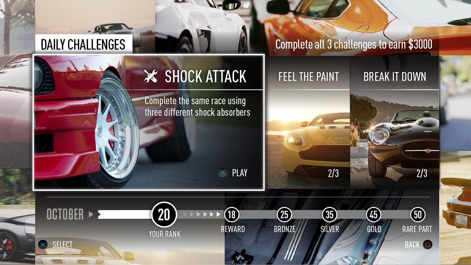
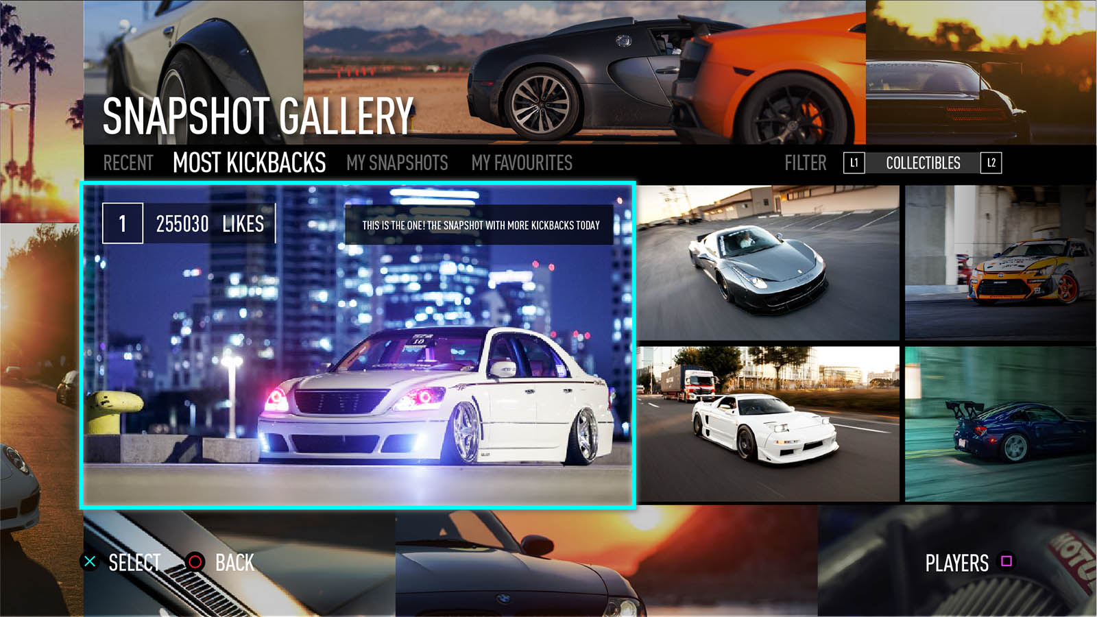
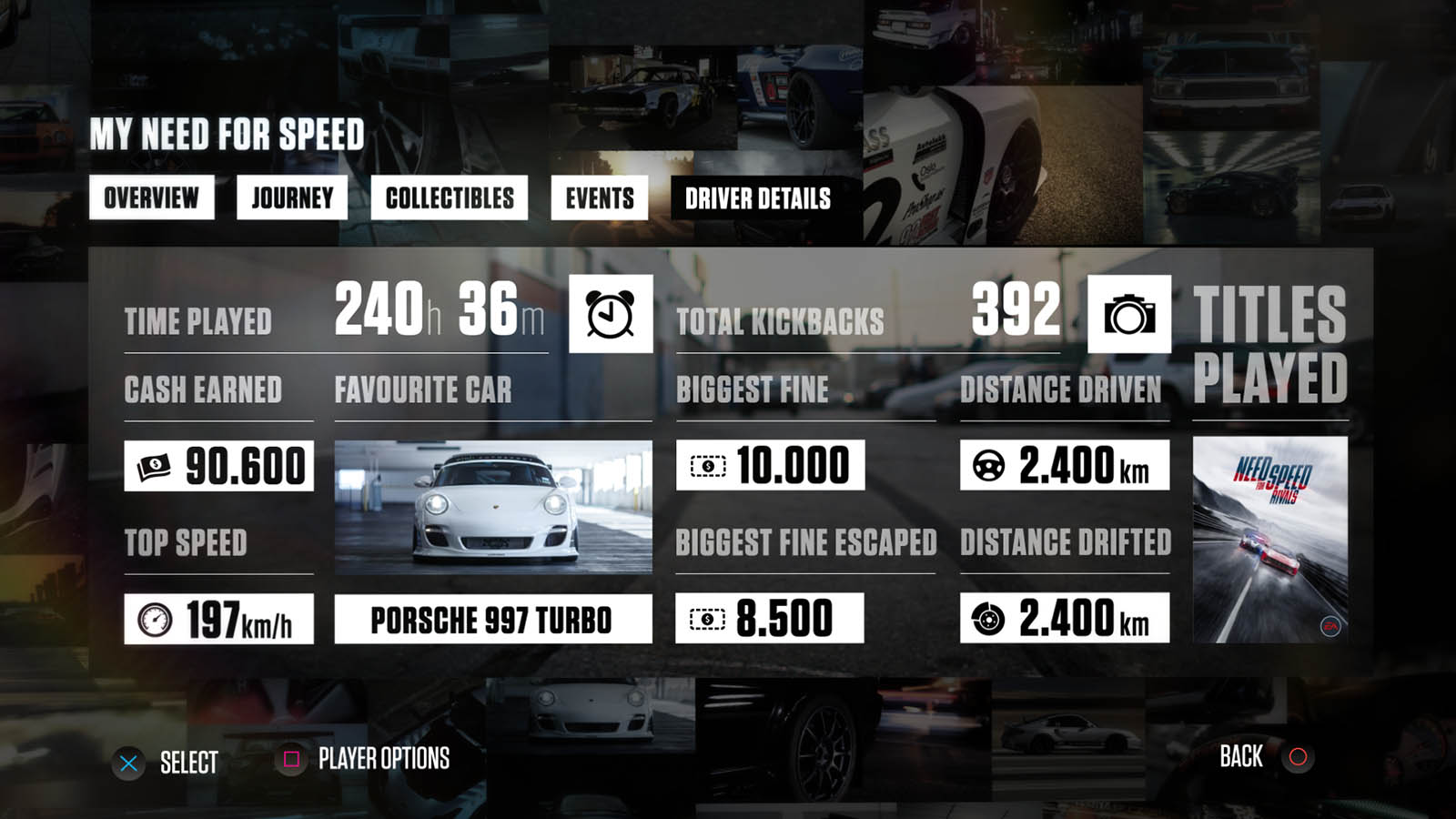
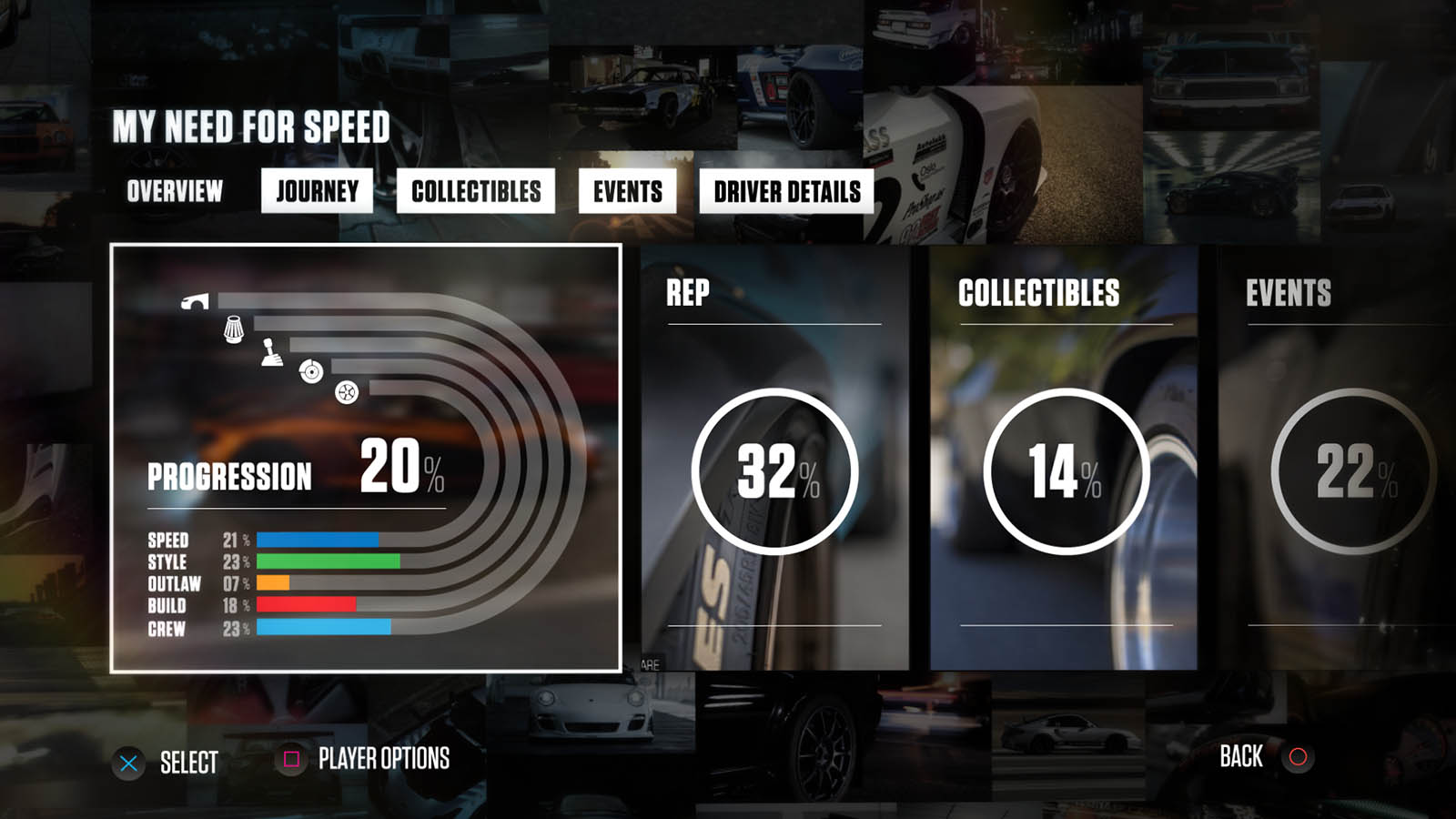
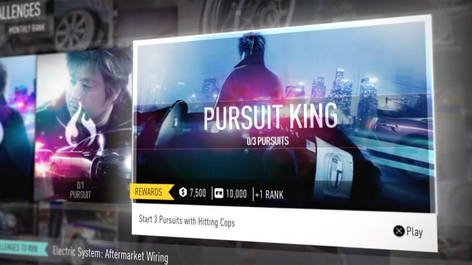
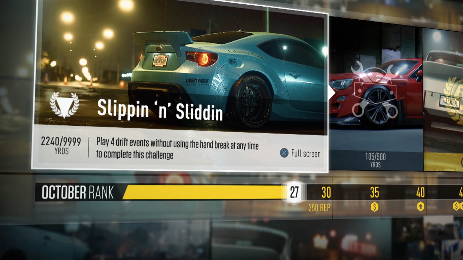
Informed by player research and in partnership with the art team, we looked at user journeys in the functionality of the menu systems; how they moved, breathed and how they felt to the user. In reviewing the whole process in terms of how functionality marries with design and animation, we suggested design concepts for the visual language, the UI and UX that stayed true to the brand and the gamers. The team also improved the information architecture and ensured smooth flow of information and a more contemporary approach to menu design.
The final design adds unique graphic moments that enhance the rich and gritty urban feel with an image led front end that conveys the emotional values of the game and a HUD that clarifies and refines the information displays.

